


IntelliPaper
Abstract
This article presents a conjecture, based on recent research carried out by the author, concerning demographic mortality. This conjecture hypothesizes that all human populations will show a common demographic mortality trend as longevity increases. In particular, the demographic mortality curve will tend to converge towards a defined theoretical curve. This curve is calculated mathematically using an abstract cellular automaton model. This automaton (which we call the Arbitrary Oscillator) is constrained to end its life cycle upon reaching a maximum number of paths defined by a parameter TC (Total Counts). In the study, we highlight the mathematical properties of the curve and compare it with the trend of real mortality curves for various populations and for various historical periods. In doing so, we use the Life Tables generated by the demographic institutes of various countries. From this comparison, it appears that the conjecture may be reasonable and an attempt to predict demographic mortality behavior and limitations for the years to come is provided. From the mathematical properties of the theoretical distribution, constraints on the future development of mortality curves can also be deduced, should the conjecture be confirmed. In this case, the mortality curve cannot exceed a certain level of maximum peak height nor fall below a minimum width at half the height of the same peak. Another typical feature of real mortality distribution curves is that they are asymmetrical, with a tail of data to the left of the maximum peak. Using the explicit function, we show how this asymmetry can be interpreted as due to the sum of several discrete sub-components within the overall distribution. A discussion is held on the nature of these possible sub-components that appear at discrete age clusters. The availability of a mathematical description of the mortality distribution also allows us to compare the model with the experimental Gompertz law, finding confirmation of it except at high ages, where our model predicts a saturation. In this article, we also consider the possibility of extending these models to species other than humans by defining a species ‘time constant’. In the conclusions, the more general theme of the nature of human aging is seen in connection to our conjecture that predicts the presence of an absolute limit (the TC parameter) on the number of ‘critical’ events. As ‘critical’ events accumulate over time by aging, approaching the final limit value, the probability of death will tend toward one as a result of a sort of statistical “pressure”. Finally, we hypothesize a conceptual link between the TC parameter of the theoretical distribution and the Intrinsic Capacity (IC) parameter defined by the World Health Organisation.
Explore Digital Article Text
Introduction
The inevitability of the end of life has always captured the human imagination, giving rise to multiple interpretations of a moral, religious and, of course, social nature in all cultures and populations. Artists have also been struck by this, highlighting how this immutable law affects all human beings regardless of their wealth or position of power (Figure 1).
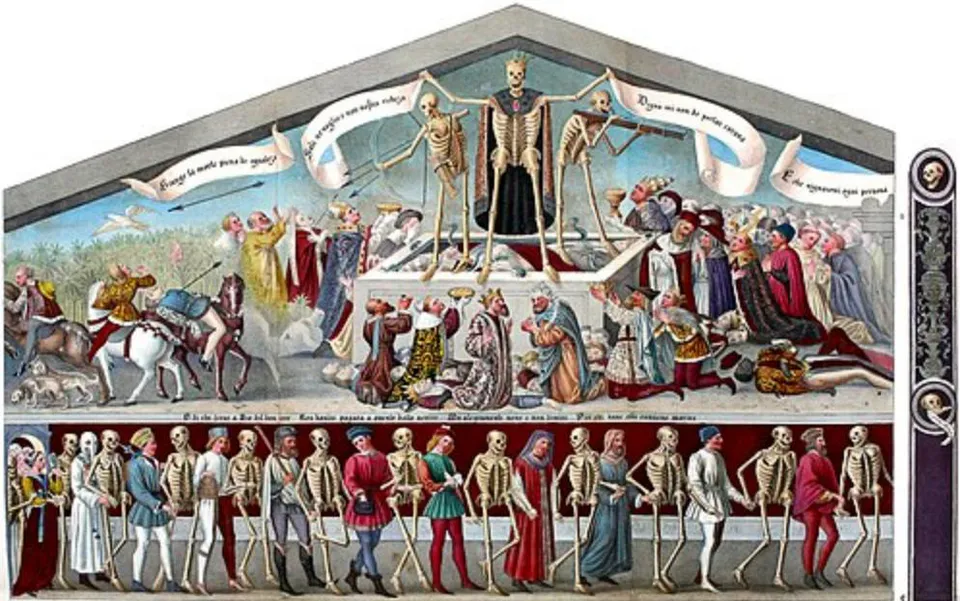
“Trionfo e danza della Morte” is a fresco painted by Giacomo Borlone between 1484 and 1485 on the exterior of the Oratory of the Disciplines in Clusone, (Bergamo). Italy. Source: Wikipedia.
In our study, however, we wish to focus, more modestly, on the statistical characteristics of demographic mortality. The literature on demographic mortality is enormous and covers a broad spectrum of scientific and social aspects. It is beyond the scope and capacity of this article to attempt to review and make reference with these studies. We will therefore only refer to works strictly instrumental to the contents of this work, leaving the correlation with other studies on the topic to the interest and experience of the reader. For our analysis, we will use the data provided by demographic monitoring institutions in various countries. In particular, the mortality data collected in the so-called Life Tables will be useful. To get an idea of how this data can be used, let’s look at Figure 2.
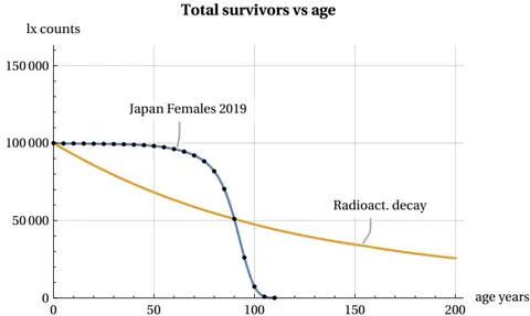
Number (lx) of survived from a set of 100000 newborn as the age increases
In this figure, we consider a hypothetical group of 100,000 newborns who progressively age from the moment of their birth. We can see that as the years pass, the number (called lx) of members in the group decreases until it disappears once their age exceeds a certain maximum limit called lifespan. A striking feature of this survival curve is that during the initial phase of youth and even during a period of relative maturity, there is no significant decline in the number of members in the group. However, at a certain point, something “goes wrong” and suddenly the number of survived decreases until the entire population group disappears. This process of ’decay’ is typical of many living beings and not only of the human species. In Figure 2, whose trend is typical for all countries, we have used mortality data from 2019 (before the impact of the COVID pandemic), grouped into 5-year intervals (Figure dots), for females in Japan, Ref [1]. It may be interesting to compare this process with other inanimate processes found in nature. Take, for example, radioactive decay, in which isotopes of a certain element decay according to the well known exponential law. This second ’mortality’ curve is also shown in Figure 2. For the comparison, we assumed that the radioactive source has a time constant such that its half-life coincides with that of our demographic group. It can be seen that, in the case of the radioactive source, the decay does not show rapid variations but continues with an exponential decrease without any apparent lifespan limit. There is no “aging” in the atomic world. I.e. the probability of decay of an atom is independent of the age of the atom. Ref. [2]. These differences are even more evident in Figure 3, which shows deaths per 5-year interval as the age of the group changes.
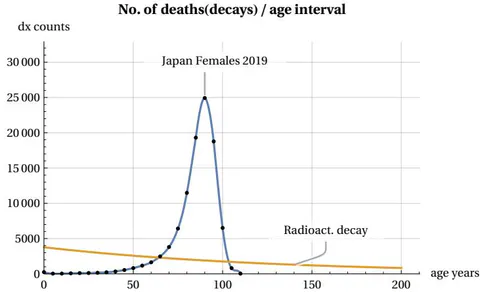
No. of deaths (dx) in a 5 years age interval as the newborn group age increases
It can be seen that, in our population example, deaths of the group remain at a low average level during youth and maturity, then increase rapidly, generating a peak in mortality, and decrease even more rapidly until they reach zero at the end of the lifespan. This rapid growth and decline in mortality does not occur in the case of the radioactive source, which maintains a slow decline. We can illustrate this difference in trends even more clearly in Figure 4, which shows the two different trends in the mortality risk (or mortality force) function (which will be better defined in section 7).
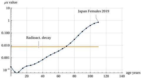
Mortality force function (μx) in a 5 years age interval as the age increases (vertical log. scale)
In humans, the force of mortality increases exponentially with age, while in the case of the radioactive source, the risk of decay is constant (remaining equal to the radioactive source decay constant). This figure also highlights a constant and typical feature of human mortality trends: in a logarithmic scale diagram, from the middle age onwards, the growth of the mortality risk function appears roughly as a straight line sloping upwards. This experimental characteristic of mortality statistics was highlighted many years ago by research conducted by the statistician Gompertz and is known as Gompertz’s law, Ref. [3]. This law is not derived theoretically, but empirically, and researchers and demographers around the world are challenged to justify the experimental data emerging from this law on a theoretical basis. We will not attempt here to review the vast scientific literature on the subject, but will limit ourselves to illustrating some results recently obtained by the author. In this article, we will illustrate a theoretical model capable of explaining the shape of the mortality peak shown in Figure 3 and thus also of justifying the characteristic of Gompertz’s law. To this end, Section 2 will present an abstract cellular automaton, called Arbitrary Oscillator, that can encounter random death events during its life cycle. In Section 3, the mathematical characteristics of the statistical distribution of death events relating to the Arbitrary Oscillator thus identified will be compared with statistical data derived for various populations around the world. The following Sections will illustrate results that predict future evolution of mortality in the event of unlimited growth in lifespan. Moreover, we will consider the hypotheses of discrete sub-components of the mortality peak that may justify the asymmetry of the mortality curves. In the final sections of this article, we will reflect on links with the Gompertz law and on the possibility of extending the model to other species of living beings. The Discussion and Conclusion section will summarize the results and model implications. All content presented in this work is the result of research conducted by the author, details of which can be found in the References. Our aim in this article is to present the results obtained by summarising the main findings and attempting to highlight their demographic significance and possible interdisciplinary correlations.
The Arbitrary Oscillator and its equations
Below, we will refer to some results of the research addressed in Ref [4], to which interested readers are referred for further details on the mathematics. Now, let us imagine that we have an abstract object capable of moving between two fixed positions on a straight line, as shown in Figure 5. Our object can decide whether to remain in its current position or move to the alternative position. The decision to stay still or move will appear arbitrary to an external observer, suggesting its unpredictability. We will call this object an Arbitrary Oscillator (ArbO) to differentiate it from the well-known object studied in classical physics called harmonic oscillator. The movements of our ArbO are synchronised with a periodic clock. At each tick of this clock, our ArbO makes a decision, and the sequence of decisions will constitute a possible evolutionary path in the object’s life cycle.

The Arbitrary Oscillator can move between two fixed positions
To illustrate these decision-making processes schematically, we can refer to Figure 6.
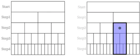
ArbO decisions splitting evolution with no-death events and with a death event at step 2 respectively
Looking at Figure 6 on the left and starting from the initial ‘Start’ position (which can be any position on A or B), we see that at each decision step there are two possibilities: to stay still or to move. These possible choices are conventionally represented by two rectangles: the one on the left represents the decision to stay still, while the one on the right represents the decision to change. This applies to each step of our clock. Note that the figures do not represent a spatial diagram of the movements between A and B, but rather a diagram of the possible alternative choices (‘stop’ or ‘go’). Let us now add another random event to our model that is not controlled by our ArbO. This event will consist of the possibility of encountering fatal events as a result of the current decision taken: that is, after deciding whether to stay still or move, our ArbO, in implementing the decision, may encounter an end-of-life event (EoL). Figure 6 on the right highlights the occurrence of this event on the map of possible decisions with a black dot. It can be seen that decisions following those in which the end-of-life event occurred will be prohibited. This is highlighted with a dark colour. The presence of one or more EoL events during the decision-making steps will lead to an overall reduction in the total number of possible paths for our cellular automaton. Note that in our simple model, we do not specify whether EoL events are induced by interactions with the external world in spatial positions A or B, or whether these fatal events occur at a certain point in time due to internal events within ArbO or by the interaction between internal/external status. EoL events may or may not occur in conjunction with a decision being made. It can therefore be seen that the number of free rectangles grows exponentially according to the law as the decision steps increase, provided there are no EoL events. If we want to describe these processes mathematically, we can refer to Figure 7, which illustrates a generic recursive ‘feedback’ branching process with termination events. In our case, the parameter will be equal to 2, and at each decision step, there will be a certain number (the ‘white’ rectangles), together with a certain number (zero or more) of events EoL (the black dot in Fig. 6).
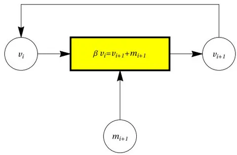
A general branching process with termination events
The sequence of the number of free cells will be determined by the following equation (1):
From (1) we see that the number of ‘free cells’ depends on past history, i.e. on the particular sequence of events . In principle, the process shown in Fig. 7 could continue indefinitely, but if we want to bring our analogy closer to more realistic situations, we must impose limitations on the duration of the process, which therefore cannot continue “perpetually”. We must therefore impose the condition that at a certain point the process must end (Constraint C1) and that the termination must occur no later than a certain maximum number (imax) of steps of our clock (Constraint C2). We also want to study, within the limits set by C1 and C2, all the possible paths that Arbo can take in the presence of a maximum total number of ‘m’ events (Constraint C3). Remembering that if the process stops, we will therefore impose the following equation:
That is, eliminating and renaming ‘t’ with ‘i’, we have, due to C1 and C2 Constraints:
The constraint condition C3 will also be expressed by next equation (3), where we introduce a parameter TC (like ‘Total Cases’) which is a positive integer . This parameter is interesting because it defines the total number of ‘fatal’ cases that can occur in the possible paths followed by our cellular automaton. It can be demonstrated that there is a relationship between TC and imax, i.e. they are linked by the equation . In other words, once one of the two values is fixed, the other is determined accordingly.
Equations (2) and (3), when TC is assigned a value, define a system of equations in the unknowns , which we will call the S-System. This system is part of the so-called Diophantine equations (named after the ancient mathematician Diophantus) since it uses variables with positive integer or null values. There are no known (at least to the author) direct algebraic solutions to an S-System, but numerical solutions can of course be sought using modern computing methods offered by mathematical application programmes. However, one characteristic of S-Systems is that they always have at least one solution: the so-called trivial one, where . This solution corresponds to the evolution of our ArbO, which at each step encounters an EoL event and a ‘free’ event and can therefore continue (making the ‘safe’ choice) the repetitive cycle until it reaches the imax clock step, where two fatal events occur and the life cycle ends. The search for solutions does not completely resolve the range of evolutionary possibilities for our ArbO. In fact, once a solution is known, it does not determine a single evolutionary path, but it can be implemented with different ‘paths’ within the diagram in Figure 6. The solutions, indeed, can be represented on a diagram of the type shown in Figure 6, where a total of TC black dots will be arranged for a total of imax rows. TC different paths will thus be identified in which ArbO reaches the EoL condition. Let us look at a simple example to clarify the concepts outlined above. Let and, consequently, with four unknowns ; in this case, the S-System takes the form (the first equation obtained by the eq. (2) multiplying by ):
and the possible solutions for this S-System are the following three:
We note that the last solution is the trivial one which, as mentioned above, is always present for every S-System. Returning now to the graphical representation shown in Figure 6, we can apply this representation to each of the three available solutions. If we take, for example, the first solution, it can be represented as shown in Figure 8:
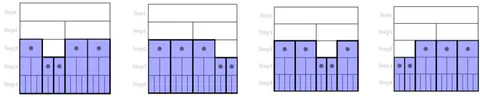
The four different instances of the same first solution for a S-System with TC=5
Figure 8 shows that there are four possible representations (or configurations) of the same solution: in all configurations e , as prescribed by the solution considered. However, there are four different situations that ArbO experiences as statistically equivalent to a single solution. We can also note, by observing the graphs in Figure 8, that while there are always five EoL events (black dots), there are also always three ‘safe’ events (white rectangles) after the start: this is a general rule for our S-Systems, namely:
The ‘most probable’ solution
We have seen in the example in Figure 8 that each solution is associated with a series of configurations in which that solution can be realised. In analogy with the criteria of statistical mechanics applied to the study of atomic phenomena, we will state that the ‘most probable’ distribution of the ‘m’ variables will be the one with the maximum number of configurations (Constraint C4) i.e. with the maximum number of ways to realise it. We will try to identify it. For reasons that will be detailed in the following sections, we are interested in studying the behaviour of ArbO, and the relevant solutions paths, when the TC parameter takes on very high values, e.g. or above. In this case, the solution calculation cannot be performed directly using the computer power. For limited values of TC, indeed, these solutions can be calculated numerically by computer. For example, in the case of , there are 510 solutions, but with , the number of solutions rises rapidly to 30,410. As TC increases, the number of solutions grows exponentially, and soon the calculation times become so long that the numerical calculation of individual solutions becomes impractical and therefore it becomes impossible to compute and study the whole set of solutions. To search for ‘most probable’ solution with high TC values, we must therefore resort to different methods. In particular, using Fermi statistics methods, Ref [5], we may identify, among the various solutions of an S-System, the one that shows the maximum number of configurations. This computation has been done in Ref, [4] and the variables can be calculated as follows (we use the index ‘r’ to highlight that these belong to a particular recursive solution):
Solution (5) is therefore the ‘most probable’ solution and can be calculated recursively. Once a value for TC has been set (usually with ), we start from and and continue by increasing the index and following the calculation process illustrated in (5). It is interesting to note that once the sequence of variables ‘m’ has been made known, the sequence of correlated variables ‘v’ can also be calculated by applying equation (1). These calculations can be performed quickly and easily with the aid of a computer. If we set , for example, we will obtain the following sequence of values (rounded to unity) . These values of the variables therefore represent the most probable solution for an ArbO whose TC (Total Cases) parameter is equal to 100,000 fatal cases. If all the values in the above sequence are added together, the total is , in accordance with equation (3). The sequence also satisfies the condition of equation (2). It can also be noted that the sequence ends rather quickly after 24 steps of our clock, leaving only zero values. This is clearly due to the rapid growth of the values of the “m” variables, which quickly exhaust the target TC values, thus creating a “peak” in the sequence of values that resembles the shape of the curve in Figure 3. It is precisely this apparent similarity in shape to demographic mortality curves that catches our attention and will be discussed in the following section. Before moving on to this topic, we need to introduce one last mathematical aspect concerning sequences of “m” values: the possibility of expressing these sequences as a continuous function (or rather “distribution”) of values. With this formalisation, it will be possible to perform calculations and comparisons with real mortality data more easily, using differential calculus. A “continuous” approximation of equations (5) was performed in Ref. [4], leading to the following analytical description of the most probable continuous distribution that we call now . It must be noted that the continuous function depicted in equation (6) shows the same constraint features of the discrete ‘m’ solutions and in particular the area under the curve will be equal to the TC parameter.
The notation highlights the dependence of “m” not only on the variable r (now a real continuous number) but also on the parameter TC, as shown in the following equations, where ‘g’, ‘k’ terms are numbers while ‘c1’ and ‘rF’ are constants depending only from the TC parameter and ‘Log’ is the natural logarithm function:
Comparison between the real demographic data and the m(r,TC) function
The ‘ergodic’ hypothesis
We now want to verify the possibility of associating the distribution defined in formulas (6) and (7) with the actual demographic mortality distributions found in the demographic LifeTables. To do this, we must first take a step back and return to the diagrams in Figure 8. Here we can see, for a specific solution case, the various paths that a generic single object, called Arbitrary Oscillator, can follow until it reaches an EoL point. In other words, we are representing the possible paths of life and death of a single ArbO object for a specific solution case. In order to extend our reasoning, we must now introduce the so-called ergodic hypothesis (with analogy of the systems described in statistical mechanics). We will assume that the various individual paths that ArbO can follow are equally probable and that there is no one path that is preferred over the others. (Constraint C5). This means that if we now consider the life cycle of a single ArbO, it can end in any of the ways described by the various available configurations. But if we now take at the same time a very large number of ArbO objects, all of which start at the same instant and pursue their life cycle, it seems reasonable to assume that, at the end of the life cycle of this cohort, the most statistically representative implementation of the ArbO life cycle will be the one that corresponds to the maximum number of possible configurations, i.e. the maximum number of ways to implement it, i.e. the most probable solution of the S-System expressed in equations (6) and (7).
The correlation with demographic Life Tables
We can now attempt to correlate the curves of our variables ‘m’ with those of the variables ‘dx’ found in the Life Tables like in Fig. 3. To do this, we will consider mortality tables structured 5 x 1, i.e. with age intervals of 5 years referring to survey periods of one year, and we impose the following equation that links the age interval ‘a’ of the 5x1 Life Tables to our time interval “r” in the ArbO life cycle:
This means that if , then age years; if , then age years, and so on. By substituting the variable ‘r’ with (a/5) in (6), we will obtain distribution curves on the same age scale as the 5x1 Life Tables. We can also generalise this relationship further by defining it as:
with ‘u’ considered as a generic time constant which, in the case of humans, we will set equal to 5 years. To visualise the shape of m(a,TC) on the age axis, we will need to choose an arbitrary conventional value of TC, which we will take e.g. as . Fig. 9 shows the linear and log. plots of the function m(a,TC) (in the following called “mTC”). The mTC values are called ‘dx counts’ for similarity with the Life Tables mortality data. It is also shown the particular ‘a’ value (apeak) that leads to the curve maximum (in this case years). The mTC curve shows also a slight left asymmetry around the curve peak.
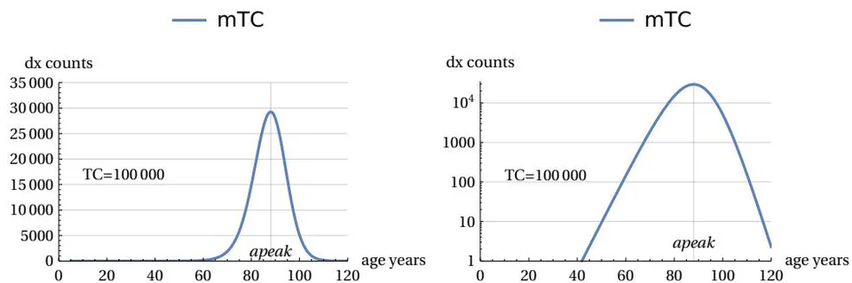
Linear and Log plot of the m(a,TC) as function of a, with TC=100000
It is interesting to highlight some mathematical properties of these curves (see also Ref. [6]), namely that: 1) there is a relationship between “apeak” and TC, which are therefore interdependent, as shown by the following equation (10). This means that, for example, once a TC value has been selected, a specific value for the peak position of the curve is automatically defined, and vice versa.
- For sufficiently high TC values, all mTC curves show the same ‘shape’: as TC increases, the curves expand their areas and shift to the right along the age axis, but do not change in structure. This characteristic can be confirmed by calculating the so-called FWHM (full width at half maximum of the curve), which tends rapidly towards the asymptotic constant value of:
- As a consequence of this constraint, there is also a maximum height limit for "normalised" curves, i.e. the mTC(a,TC)/TC curves obtained by dividing the curve itself by the value of the current TC parameter, which is also – let us remember – related to its area. This height limit, which will always be less than 1, will have the asymptotic value of:
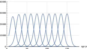
The availability of normalized ‘mTCn’ curves could be used to evaluate the shape of the various mTCs when distributed over an age range similar to that of the demographic Life Tables, keeping the conventional value of fatal cases at 100,000. To obtain the comparison, it will suffice to multiply the ‘mTCn’. curve by the number 100000. This scale change is carried out in the following Figure 10, which illustrates the different theoretical mortality curves between 15 years and 150 years for ten ‘apeak’ values -15 years apart from each other- and with an area (i.e. number of cases) equal to 100,000 over age intervals of five years. The figure shows the constant ‘shape’ and constant maximum height of the various curves after the age of 40.
Deaths (dx) as per normalized mTC for 100000 cases and ‘apeak’ values 15 years apart
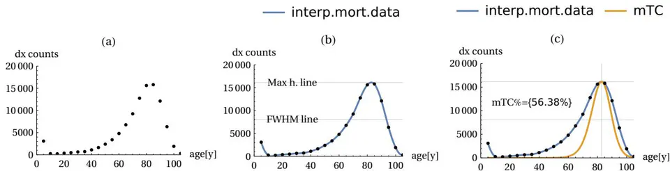
With these conventions defined, we can highlight the correlations sought using a simple graphical method. Figure 11 below illustrates this in detail. We start by using the data from the Life Table for the historical year we want to study. The “dx” data from this table are plotted on a graph (Fig. 11-(a)). Using standard computer interpolation programmes, the points are joined with a continuous line (Fig. 11-(b)). With the mathematical availability of the continuous line, it will be possible to calculate and associate some interesting parameters with the raw data of the Life Table considered, such as the height of the mortality peak, the age at which the peak occurs, and the half-width at full height (FWHM) of the curve itself. Finally, in part (c) of Figure 11, it will be possible to make the desired association between the actual mortality curve and our mTC of equation (6). In fact, from the age of maximum mortality (“apeak”) found in (b), it will be possible to analytically determine the value of TC using equation (10) and then plot (by means of a resizing operation) an mTC curve with the same vertex as curve (b), obtaining Fig. 11 (c). With the two curves identified analytically, it will be possible to integrate them numerically and also determine a percentage coincidence factor between the two areas, specifying the fraction of common area covered by the underlying mTC curve. This

Demografic mortality data (dots in (a)) are interpolated with continuous curve (b) and overimposed on a apex compliant mTC curve (c)
Comparison between United States, Italy and Japan Life Tables ‘dx’ data and the m(r,TC) function
A large amount of mortality demographic data is available for the various countries and year of collection. We here chose to use USA, Italy and Japan data. These countries differ in terms of history, geographical location, customs and traditions and population size, and therefore constitute a good test bed for determining statistical invariants despite their differences. It should also be noted that the Japanese and Italian populations are those with the highest longevity and are therefore useful for studying trends based on this statistical characteristic. The data for Italy and Japan are available at Ref. [7-8]. These data span a 45-years period from 1974 to 2019 (having excluded years after 2019 to avoid statistical peculiar effects due to Covid 19). The USA data were processed from a database of tables made available in the works in Ref. [9] and [10]. The USA data range runs from the year 1900 to the year 2017 mainly in ten years steps, while the Italy and Japan data are available at five years intervals. Given that there are significant differences in mortality between males and females, gender distinctions have been maintained in the data groupings. This selection of data from the various Life Tables is summarised in Table 1 below.
All these different data sets were subjected to comparison with theoretical predictions of the mTC function using the method described above. This was done by also including in the analysis a graph showing the difference between the actual demographic curve and the theoretical MTC curve; these differential graphs typically show two lobes, one more pronounced on the left and one smaller on the right, in all the situations considered. In the following we provide an example of the graphic evidences obtained. The period figures have been minified to give a quick look overview of the evolution of the shape of the curves. Further data are available in the work of Ref. [11].
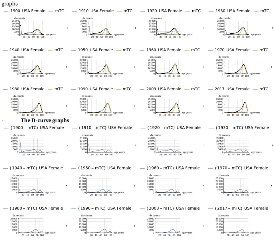
USA female mortality graphs with poll points, interpolated curve and MTC curve togheter graphs with the ’difference’ curve
The conjecture on demographic mortality
Let us now consider the trend shown in the miniaturised graphs in the previous section. A qualitative trend is clearly evident, as the sampling years progress from one to the next, with all the demographic mortality curves converging towards the shape of the theoretical MTC function. This can also be appreciated visually by observing the progressive reduction in the areas of the right and left lobes of the graphs showing the differences between the two curves. This trend is present, albeit to a greater or lesser extent, in both sexes. Our conjecture on demographic mortality can be summarised in the following statement:
The dx curve of demographic mortality will tend to coincide with the theoretical mTC curve as the longevity of the population under consideration increases.
The above qualitative assessments can be confirmed by numerical measurements of three important parameters: the FWHM, the height of the peak vertex dx, and the difference between the total area covered by the actual curve and the area of the theoretical MTC curve. If the conjecture is credible, then the numerical data should show that the actual peak of the curve will narrow in FWHM and consequently rise, and the area of difference between the two curves will tend to decrease when the longevity of populations increases. The following figures show these trends measured quantitatively. The first figure shows how, as the year of the sampled period increases, the life expectancy parameter ’e0’ also increases, indicating an improvement in the longevity of the populations considered (Fig. 13) accordingly with our assumption. The next figures shows how the FWHM for all cases tends to decrease, approaching the theoretical minimum limit of 15.6 years (Fig. 14). The Figure 15 shows how the height of the mortality peak increases progressively as the peak itself narrows. Finally, the last Figure 16 shows the mismatch ratio ’(|AL|+|AR|)/AT’, where |AL| and |AR| are the absolute values of the areas of the left and right lobes in the difference graphs, and AT is the total area under the actual curve for the case considered. This mismatch tends to decrease, confirming the hypothesized trend.
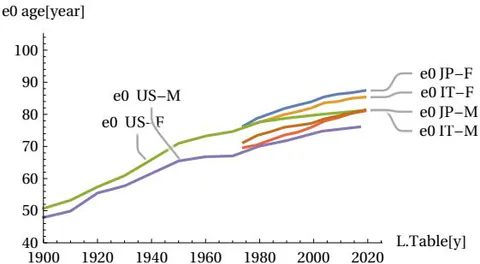
Life expectancy e0 compared to the year of survey for the United States, Italy and Japan, showing an increase in longevity for the three countries
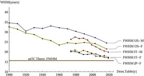
The FWHM of the mortality peak for the United States, Italy and Japan showing a trend towards the theoretical minimum limit
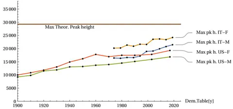
The mortality peak heigth for the United States and Italy showing a trend towards the theoretical maximum limit, (Japan data omitted for similarity with italian data)
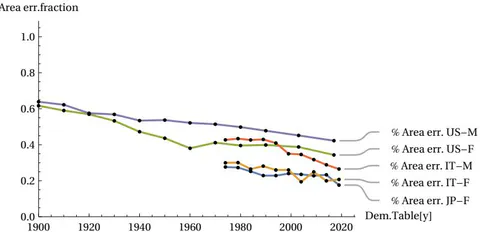
The area mismatch between real and theoretical curves for the United States, Italy and Japan F., showing a trend to reduction
A test with regional data
The data highlighted above confirms the credibility of our conjecture. These data, however, consider homogeneous subgroups of both sexes in the various countries considered. The question therefore arises as to whether, within a single country, the conjecture will be valid when restricting the field of analysis to further subgroups, for example, chosen on a regional basis. Counterexamples could therefore emerge that contradict the conjecture by analysing the same groups of males/females distributed across the various regions of a single country. This analysis was carried out for Italy in the year 2019. The following figures illustrate the statistical dispersion of the two parameters FWHM and maximum peak height, according to the various regions into which the population is divided, always considering the female sex (more long-lived). Figures 17 and 18 show that, around the horizontal dotted line marking the average statistical limit for the whole country, the various regional cases (indicated with a distinctive region label) are positioned above or below this limit. However, none of the regional cases exceed the theoretical limits. Figure 19 shows the “best” region found in approaching the theoretical curve.
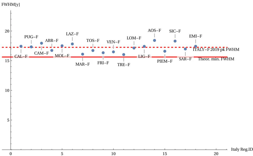
The FWHM of the mortality peak for the Italy Regions does not fall below the theoretical limit
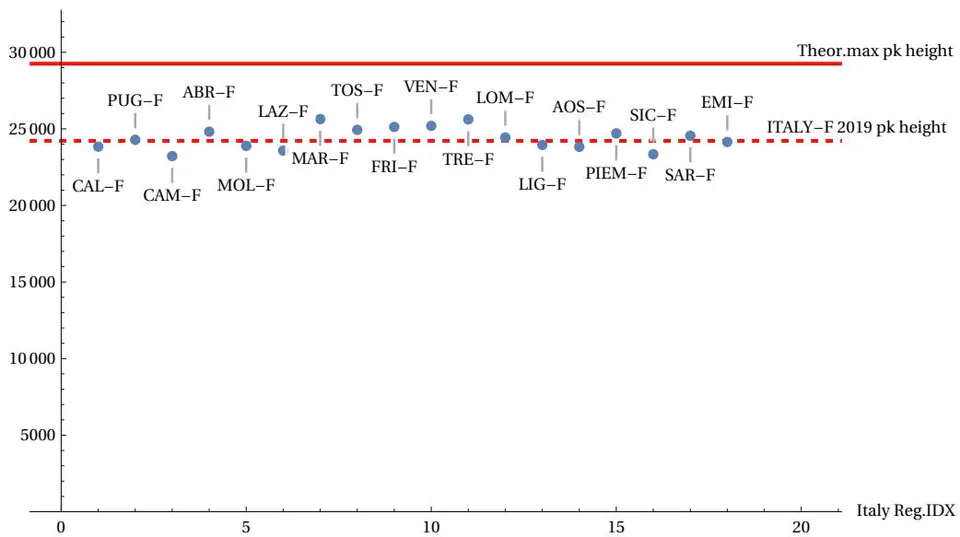
The max. mortality peak height for the Italy Regions does not exceed the theoretical limit
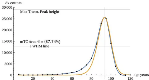
The mortality curve of the Marche Region (Italy) corresponds quite closely to the mTC curve (red)
An attempt to forecast demographic mortality for the coming decades
Considering the above data, there is an almost linear trend in the growth of life expectancy (Fig. 13). This justifies the assumption of a continuous future growth in lifespan and a consequent reduction in the width of the mortality peak. This also allows us to try a forecast for the future evolution of demographic mortality. This can be done by using the mTC function and assuming a future peak linear improvement in continuity with the rate of change recorded in the last years of population surveys. The result of this simulation is shown in Figure 20 for the case of Italian females.
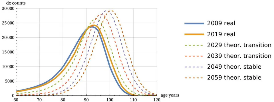
Possible future evolution of demographic mortality according to the conjecture (Italy female case)
The figure shows the latest demographic curves (2009 and 2019) along with the theoretical projections of the mTC normalized function - multiplied by 100,000 - when it assumes a constant shift rate for values for the years 2029, 2039, 2049. These peak values are calculated with the same peak growth rate recorded for last years survey. It is interesting to note that, as predicted in Section 2, the theoretical mortality curves, while shifting on the age axis, maintain the same shape and height at 29,254 deaths (over 100,000 total) on the peak mortality.
Of course, in this hypothetical prediction the demographic curve must also confirm the trend of narrowing left skewness, i.e. we must hypothesize a transition phase from the ‘skewed’ curves to the final curves. This is shown in the figure with two intermediate curves arbitrarily approaching the theoretical shape. If this last trend were less fast, then the above forecast might be different. This will depend on the speed of reduction of the left skewness.
The components of demographic mortality
From the graphs of the real mortality curves analysed so far, in addition to the characteristics already highlighted, one can consider into detail an invariant aspect present -in a more or less accentuated way- in all the real curves: this characteristic is the asymmetry of the mortality curve which shows a ‘tail’ to the left of the peak and this together with the presence of two other characteristic areas. We can highlight these aspects by observing the following Figure 21 (the division into three areas).
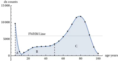
The division of the demographic curve into three areas: A (infant mortality), B (accidental/youth mortality), and C (senescence mortality)
The analysis was carried out by the author in Ref. [12] and here we report a summary. The following figures show the breakdown of area C into sub-components (Figure 22). These sub-components are always theoretical mTC functions but with different TC parameters. Three of them are distributed with peaks positioned to the left of the main peak and the fourth largely coincides with the main peak. These four sub-components are sufficient for their sum to coincide with the real points of the Life Table zone C (Figure 23).
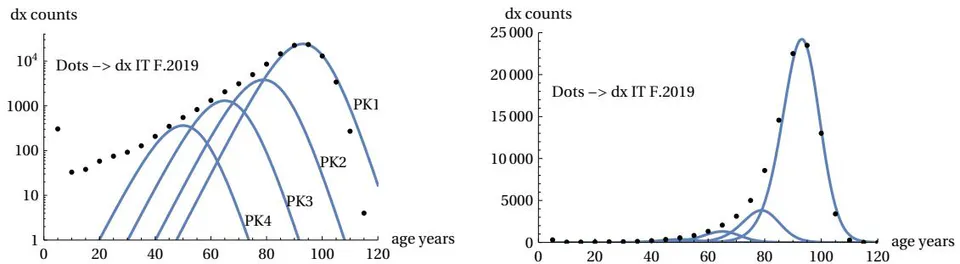
Mortality curve C area split into four components for Italy 2019 females. (Log scale left and linear scale right, dots as per Life Table)
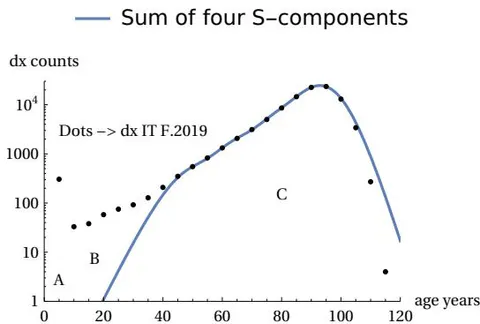
Mortality curve A and B zones and total sum of C sub-components for Italy 2019 females. (Log scale, dots as per Life Table)
The analysis was carried out for all the countries considered above and in all cases, including the gender breakdown, the presence of this division was found. For all cases, four components are sufficient to construct zone C. We can therefore interpret the asymmetry of the real curves as due to different components of the same theoretical curve. The area of three of these components is much smaller than that of the main component, and the areas decrease as one moves away from the main peak, as can be seen in Figure 24.
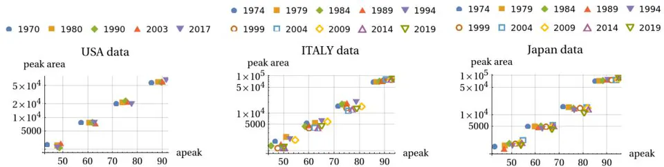
Evolution of the peak area vs peak age for the four peak components for Japan Females (historical data from 1974 to 2019)
The four peaks are almost equally spaced (between 11-15 years interval) in the age peaks (for females at 50, 63, 77, 90 ages) for almost all cases/countries considered. This is also shown in Figure 24. These graphs plot the areas of the components vs the ‘ap’ parameter. It is seen that four clusters of points identify the four components of mortality. This feature - common for the US, Italy and Japan - leads to a similarity in peaks shape for the three countries for both males and females.
The graphical calculation procedure used so far allows us to highlight - in addition to the main mortality peak - three other smaller peak sub-components located to the left of the main peak. This was done for all the mortality tables considered here (USA, Italy and Japan) for both sexes and for all the years considered. This allows us to observe how these four peak components evolve over time. This evolution is shown in Figure 24 for the case of Japan Females (historical data).
The graph shows how the four peak components maintain a very high stability in terms of the area of the components (the percentage of the total area of zone C) and how their peak ages move towards older ages in a synchronized way. This synchronized movement towards higher ages is consistent with the improvement in lifespan over the years.
Another interesting aspect is the relationship between the peak age () and the standard deviation () of the components. For each component, the relationship between and is linear, as shown in the data. This linear relationship suggests that the four components are not independent but are part of a single structured process that governs the evolution of mortality in zone C.
Some considerations in relation to Gompertz’s law
Looking at Figure 14, in the left part where the curve is almost a straight line in the log-linear graph, we find the so-called Gompertz law. This law states that the mortality rate increases exponentially with age. In our model, this exponential behavior is an approximation of the mTC function in its initial phase.
However, at very high ages, the real data shows a flattening of the mortality force (), which is no longer exponential. This is well represented by our model, which shows a saturation of the function.
Figure 25 shows the comparison between the Gompertz law and our model at high ages. It can be seen that the theoretical high age threshold is exceeded, say above 110-115 years, we would find ourselves in a condition of mortality risk independent of age but, as in the case of the radioactive source discussed in the Introduction, constant over time.
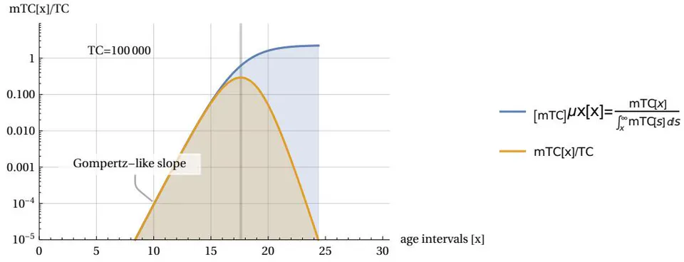
Mortality force (showing a flattening at high ages) and normalized mTC function (TC = 1000000) with vertical log scale (cf. Figure 14)
A look at other biological species
Up to this point, our analysis has considered demographic data referring to the human species. A question might arise in the reader as to whether the model discussed thus far can be applied to other biological species. In particular, one might ask whether the aging phenomenon highlighted in the curve in Figure 2 is present in other living beings. Without wishing to make generalizations, we can answer that yes, in many cases, even very biologically diverse ones, the aging phenomenon can be detected. To illustrate this statement we can see the following Figure 26.
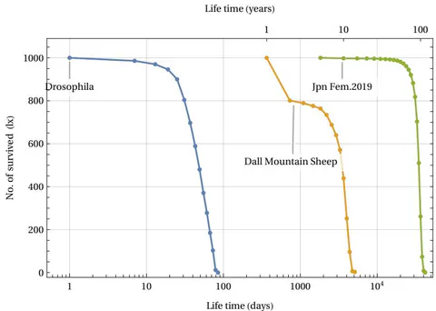
Survived numbers versus life time (normalized to 1000 newborn) for three species (log. time scale)
The figure shows data from three Life Tables for different biological species: the fruit fly Drosophila (laboratory tests as per Ref. [17]), the Dall Mountain Sheep (Ref. [18]) and an example of a human species (Life Table of Japanese females in 2019, Ref.[8]). In all three cases, the phenomenon of aging (defined as the rapid disappearance of living things after a certain critical age threshold) is evident. This is despite the significant difference in lifespan, which ranges from approximately 100 days to 100 years. In the case of Dall’s sheep, the initial rapid decline was due to infant mortality induced by the presence of predators in the natural area where the data were collected. If we represent these same data by measuring the deaths over the time interval, we can obtain the following graph in Fig. 27.
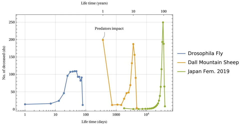
Deaths number versus time intervals (normalized to 1000 newborn) for three species (log. time scale)
Here we see – despite the large differences between the species and the times involved – a similar invariant structure appearing for all three cases: the mortality peak in deaths. Recalling the discussion in section 3.2 and equation (12), and evaluating the FWHM of these mortality peaks, we can estimate what we have called the time constant typical of the species, i.e. the parameter . This parameter determines the temporal cadence of the statistical aging process in our ArbO model, that is, it tells us how rapidly the development of the time steps brings us closer to the process of exhaustion of the capacity of total available cases given by the parameter .
The comparison between different species is summarized in Table 2, which shows the time constant and the parameter for Humans, Dall Sheep, and Drosophila.
| Species | Time constant | parameter |
|---|---|---|
| Drosophila | days | |
| Dall Sheep | year | |
| Humans | years |
Time constant and parameter for three different species
A kind of biological clock
If we observe the equations that regulate the progress of our ArbO (see also Fig. 7):
we can associate the clock stroke with the recurring parameter , and we can interpret the sum of the events and as critical events of a set . The set can therefore include events with a "fatal" outcome (like ‘mortalis’ in ancient Latin) or "vital" outcome . We can study the evolution over time of these quantities as the clock varies. This evolution is shown in Figure 28.
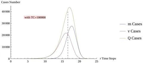
Evolution of m, v, Q events number vs r clock steps for the most probable solution
In the figure (where the usual parameter is used as a standard reference) we see that critical events begin to appear significantly after a certain number of steps , say after the tenth step. From here on, the growth of critical events increases exponentially, even if, in their initial internal distribution, type events prevail over type events. Once a certain level of is exceeded, where the events equal the events, the events begin to prevail over the events. This can also be effectively represented by the power relationship depicted in the following Figure 29:
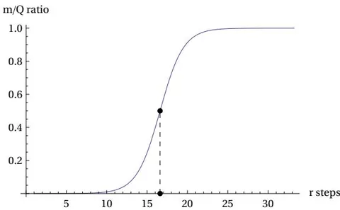
(mr/Qr) Logistic shape for TC = 100, 000 (as per Equation 15)
The equation (15) shows a logistic shape, which is a characteristic feature of the mTC function and which is found in the description of natural and social processes. The parameter (which we can call the ‘Fermi time’) is what signals the turning point.
Discussion
We’ve seen in the previous sections how there are many possible analogies between the behavior of the statistical life cycle associated with our abstract object called ArbO and the mortality cycle of living beings, particularly with demographic mortality data. The conjecture presented in Section 4 -namely, that as population longevity increases, the mortality curve will tend to coincide with the theoretical maximum-likelihood curve of ArbO- if assumed to be valid, has led to interesting predictive results, all related to and consistent with the theoretical model of ArbO. Let’s briefly review some of these spin-offs of our conjecture.
It will be possible to associate the real statistical measures of mortality from the Life Tables with a theoretical continuous function that has the same age value as the peak and coincides with the vertex itself, this will allow us to identify a theoretical TC parameter from which other significant properties of the model will then derive.
Zone A (infant mortality) and Zone B (constant dx) are not foreseen by the ArbO model, therefore, as longevity increases, they will tend to disappear.
Similarly to the increase in longevity (i.e. the increase in the age of peak mortality) the statistical peak of the ’dx’ data of the Life Tables will not be able to narrow indefinitely, but will be limited to a FWHM value equal to 3.12 * u, where ’u’ is the characteristic time constant of the species (in our demographic case assumed to be equal to five years).
The additionally identified height limit also gives us a quick test for future Life Tables with 5-year age intervals: the ’dx’ data for them in the maximum mortality interval may not exceed 29.3 % of the total cases.
With the availability of a continuous mathematical description of the theoretical mortality curve, it is possible to hypothesize the asymmetric ’tail’ to the left of the mortality peak as the result of the presence of four components having the same curve shape, but with different TC parameters. In particular, the four aforementioned components appear on average equally spaced in the age peaks (for females 50, 63, 77, 90 ages) and are always present for all sample years and in all the three countries considered. On this aspect, a correlation with a recent study using a multi-omics approach must be highlighted: in a paper published in August 2024 in the journal Nature Aging (Ref. [19]), researchers highlighted a non-linear disease risk that accumulates with the biological ageing process. "The analysis revealed consistent nonlinear patterns in molecular markers of aging, with substantial dysregulation occurring at two major periods occurring at approximately 44 years and 60 years of chronological age" (cit. from Ref. [19]). This study involved a sample of US persons aged 75 years and under. In our present study, we showed the possible existence of discrete components of demographic mortality with age clusters.
The proposed theoretical model is not based on interpolations of numerical data series or attempts to fit the data themselves. In other words, the model is built on theoretical, not empirical, foundations. In this sense, when compared with Gompertz’s empirical law, the model does not contradict it, but rather confirms it within the range of greatest experimental validity of the law itself. The model also contributes to the debate on the slowing of the mortality force, highlighting its saturation at extreme ages.
The model proposes a single general mortality function that depends only on an absolute parameter TC ("Total cases") and that varies with a time clock ’r’ that can be transformed into an age datum ’a’ of the modeled subject by using the relation a = r * u, where ’u’ is the species time constant. This allows the study of Life Tables of different species using the same mathematical framework.
The above-listed implications are the most immediate ones of our proposed model. However, a more fundamental correlation must also be considered when analyzing the model’s similarities with social aspects. We would like to cite here a fragment of the conclusions reported in the text of our initial research on the model. These considerations are still valid, so we propose them again to the reader. Indeed, "when we associate an abstract object such as ArbO with real living subjects we can assume direct analogies with e.g. mortality events but less clear, in the analogy, is the meaning of the TC parameter and also of the v and Q variables. For the latter two variables we can give interpretations such as: number of "critical" decisions/events in a time interval (Q variable) and number of "safe-ending" decisions/events in the same interval (v variable). For the TC parameter ("Total Cases"), there is no clear reference to the reality addressed in the analogy. In the ArbO model, the TC parameter limits the maximum number of paths in the "path space." Limit reached which, all possible events must lead to the end of the life cycle. In sociological terms, our TC could represent a generic social target parameter such as ’longevity’, whose improvement corresponds to a similar improvement in life expectancy. An example of such ’social’ parameter can be the ’Intrinsic Capacity’(IC) , a concept introduced by the World Health Organization, in the context of the healthy ageing target. The IC parameter refers to an individual’s overall functional reserve, that is, the set of his physical and mental capacities that determine his well-being and autonomy as he ages." (Cit. from Ref [4]). Another correlation between the model and recent research it is its connection to the nature of aging. The proposed model does not address the specific mechanism of aging, that is, whether it is due to degeneration at the basic biological level (cellular and/or DNA) or at the systemic level (e.g. reliability models based on increasing failures in the aging organism as a whole). The model proposed here highlights the statistical nature of the "pressure" to end one’s life cycle once a maximum TC limit of critical events has been set, which is approached over time. Naturally, this forced termination of the life cycle is imposed by the constraints assumed a priori and highlighted throughout our discussion. These constraints are fundamentally based on the assumption that the model’s life cycle cannot proceed indefinitely but must terminate under certain mathematically quantified conditions. Furthermore, the ways in which the process terminates are assumed to be equivalent, unpredictable, and without most likely paths. A constant comparison with future Tables of Life will confirm or deny the validity of the proposed model. A possible extension of the model could also be evaluated by moving from the animal to the plant world. The branched structure of many plant species could, in fact, be a potential application for our cellular automaton.
Conflict of Interest
The authors declare no conflict of interest.
Ethical Approval
Not applicable
Data Availability
The datasets used in this study are openly available at [repository link] and the source code is available on GitHub at [GitHub link].
Funding
This work did not receive any external funding.
References
Cite this article
Related Research

Special Issue
Launch a focused special issue to highlight research, emerging trends, and expert insights in your academic field.