


IntelliPaper
Abstract
This article explores an area of graphic design and social design that highlights graphic pieces in public settings, circulating in spaces of social exclusion to generate an exchange between a disabled person and a bystander, due to the economic scarcity of the communicators in a situation of poverty. A preliminary has enabled the creation of a corpus of visual materials, mainly printed, ranging from handwritten or “scribbled” notes, to printed materials for soliciting alms due to economic hardship and the specific issue of deafness. They are conveyed through popular sign and printed symbol systems that accompany this type of visual language. To address these practices, we use a qualitative methodology, while acknowledging the need for critical discussion about the extent to which methodologies are appropriate or even possible in such fragile contexts of care. We emphasize a form of visual testimony that this research defines as “graphics of silence,” based on material evidence emerging from precarious conditions. This reflection and proposal aim to document a circuit of graphics that emerge from a subaltern position, motivated by the need for donations within a transactional exchange. These materials lie beyond the usual territories of academic and professional design and are thus considered as legitimate objects of study from a situated perspective.
Explore Digital Article Text
I. INTRODUCTION
This article seeks to explore a contested area of social life as a part of visual culture in the urban context of Chile's capital. Specifically, it examines printed documents found in the public sphere (pedestrian areas and public transport), offered by individuals in vulnerable conditions—mainly people with disabilities (or those who feign them) or street vendors. These non-normative, non-professionalized graphic expressions emerge spontaneously and unpredictably in public spaces marked by social exclusion, which compel a form of informal labor that often borders on soliciting charity. This type of begging is framed by concepts rooted in both biblical and capitalist traditions, emerging from a condition of precarity.
Given the fragile condition of both the object and subject of our study (graphic artifacts and the people who make them circulate), we refer to some authors—though not directly aligned with our approach—such as Geert Lovink. From a European perspective, Lovink identifies a contemporary condition of "precarious life" resulting from "our intense life of prototypes," framing it as a kind of lament (Lovink, 2019, pp. 10–12). At the same time, Lorusso (2024) suggests that certain Western belief systems try to solve design problems through a form of "disillusionment" to negotiate the gap between management and execution, bureaucracy and innovation. On the other hand, Bonsiepe (2012) foresees a possible "crisis" where design could shift toward the operational or performative character of material and immaterial artifacts—in terms of behavior that is inserted into cultural and social dynamics (p. 264).
This raises an contributive convergence—one we do not intend to fully address—explored by authors closer to the Southern Cone such as Escobar, Osterweil, and Kriti Sharma (2024). They focus on relationality, proposing that we are inextricably linked to each other, to the Earth, and to a multitude of non-human entities. They warn that the accumulation of power and processes rooted in Europe and other hegemonic regions has been fundamental in the destruction of relationality, producing individuals who function within a so-called market economy (p. 26). Beyond the literature and epistemological margins of design discourse in the current planetary crisis, this "market economy" is also expressed in "other ways", that serve marginalized people in urban spaces to survive in developing countries.
A piece of paper—sometimes printed, other times scribbled by hand—as a transactional artifact, assembles a space of sociability when requesting a voluntary contribution based on a demand. For example, these disabled people offering printed calendars to passersby. When the printed paper is not self-written, other variables emerge that appeal to the small local graphic industry: neighborhood print shops, paper distributors, mixed-goods bazaars, shops that sell all sorts of items while also offering digital printing services, etc. Here we refer to graphic evidence that alludes to willful solicitation while simultaneously citing clichés or imaginaries of immediate proximity. For instance, the figure of Condorito, a prominent comic strip character in Chile and other regions in Latin America.
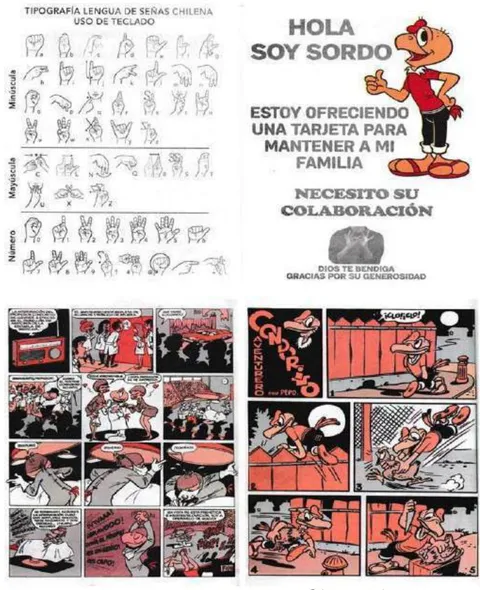
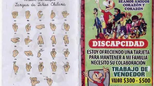
Figure 1: Above: Leaflet with Chilean Sign Language alphabet and the use of a keyboard by a deaf person offering the printed piece as a means of supporting their family. The pamphlet includes a "pirated" Condorito comic from 1949 (in his early years). Condorito is the most important and recognizable character in Chilean comic history.
In this proposal, we refer to a form of expression and articulation of short-lived materials—ephemera—as "graphics of silence", due to their deregulated echo of dissemination, which nonetheless continue to exist through the requests of a group of garbage collectors during national holidays, in a newspaper delivery person on New Year's, or in a deaf individual who communicates visually through a graphic action impulse. In a way, these are performative spaces that demand attention ("I give or express something in exchange for something in return"). Hence, within this tense space of graphic productions and forms of manifestation, we find various taxonomies ranging from handwritten notes to full-color digital printing.
As a working corpus, based on approximately one hundred papers with printed and handwritten content, we focus on graphics acquired or spontaneously found on the street, in dumpsters, small declining print shops, public transportation; pieces received at home, and even provided by people in our networks. For this project, which includes handwritten notes, calendars, brochures, manuals, and objects of donation, we aim to reflect on the limits of design and its relationships with social action, particularly considering challenges related to linguistic and expressive development.
This article examines materials and a material network that disseminates evidence of people unable to meet their physical and psychological needs, and how, from disadvantaged and contested spaces, they seek a sense of communication that interrogates the ethical and transactional dimension of design. At the same time, it raises questions about the social intentions that this discipline shares with other areas of knowledge, leading us to reconsider hegemonic representational approaches constructed from social contexts that are foreign to our local and continental reality.
As Richard Sennett aptly states, "objects do not inevitably fall apart from within, like a human body. The stories of things follow a different course, in which the importance of metamorphosis and adaptation grows through human generations" (Sennett, 2009, p. 16). This reflects the interest in valuing certain graphic productions that are as fragile as they are testimonial, whose internal logic operates within certain traditions of thought and action. These are defined as subaltern from a singular perspective marked by modern, expert, professional, and certainly Western biases (Banerjee & Wouters, 2022; Carey-Thomas & Bayley, 2023). For this reason, too, it becomes complex to categorically establish gender issues in the examined material, since those who produce and distribute these items are mostly men, on the basis of evidence obtained.
II. THEORETICAL FRAMEWORK
For approximately two thousand years, an artistic practice referred to "any human activity carried out with skill and grace" (Burke, 2001; Shiner, 2004). However, in the 18th century, it was split into two categories: the particular and refined experience of the "fine arts" (poetry, painting, architecture, and music), versus everyday outputs associated with the useful or relational (embroidery, storytelling, bookbinding, shoemaking, printing loose leaflets, etc.).
Thus emerged what came to be known as arts and crafts, which eventually paved the way for the formation of a modern discipline in the 20th century called Design—initially without machine intervention and based on manual production. This marked the transition from unique, handcrafted objects to technoscientific ones (Ledesma, 2003), standardized and produced in larger quantities. This sparked another issue: the debate between high and low culture and its cultural ramifications. A cultural artifact emerged, no longer imbued with an aura, and could be technically reproduced (Benjamin, 2018; Buck-Morss, 2001). It became a material expression of vernacular origin—be it a family photograph, a product label, a political pamphlet, or a flyer asking for charity.
Interest in graphic and visual elements from popular culture became evident some decades ago, first in some Anglosphere nations, through serialized art or design expressions (posters, books, magazine covers, vinyl record sleeves, etc.), in a context of opposition or relation between peripheral (or Third World) cultures undergoing development and hegemonic or developed cultures (Bonsiepe, 1985; Escobar, 2017; Fry, 2011). With the subsequent shift brought about by the transient phenomenon of postmodernity in its connection to graphic design (Pelta, 2004; Poynor, 2003), the problem between dominant and subaltern cultures was relativized. Nevertheless, controversies arose in which the boundaries between professional and self-taught design blurred, to the point where modern designers like Massimo Vignelli considered it a "cultural aberration" and Steven Heller labeled it "the design of the ugly" (Poynor, pp. 148–149), from a position of dominance.
Therefore, it is worth asking: what differentiating modes certify the autonomy of designers who, from professional or academic fields, have validated the discipline through a unique and specialized production of images and visual communications? This involves addressing the shift in graphic design work from a profession based on manual skills toward a practice mediated by software that precedes certain intangible operations (Manzini, 2015), where the issues defining graphic design reside online and in software programs, making the discipline's knowledge public.
In this late-20th and early-21st-century context, an interest emerges in Latin America and Chile— from within the discipline of Design—in what is defined as "popular graphics", both in typography and in the treatment of images and the reappreciation of the manual stroke (Álvarez, 2004). Locally, this refers to the concept of rescuing urban-popular graphics, typographic safari, or vernacular graphics, among others, as initiators of a new decolonial perspective that intends to question hierarchies of knowledge and norms that are deemed acceptable or correct by Anglo-Eurocentric modernity. This line of thinking from radical exteriority (Quijano, 2014) made it possible to consider certain aspects of the uniqueness of local contexts in relation to inherited excluded gazes on marginalized graphic expressions.
In this way, various initiatives, projects, and publications related to design practices began focusing on the informal production of objects and graphics to find new ways of approaching local identity. They considered the visual expression of urban popular culture as a subject of documentation, to rewrite—or at least complement—the official history of Chilean identity from a more inclusive perspective. Early signs of attention to neighborhood and communal graphics at the intersection of typography and graphic design in design schools came from projects like Gráfica popular chilena (1994) by Patricia Armas, who at the time raised the issue of "how things are said, and which things may not properly fit within the disciplinary field of design" (Armas, 1994, p. 23). This raises a longstanding question about the boundaries of design productions—namely, what are the indicators for whether or not a particular graphic expression or action "is design," especially when it emerges from a cultural framework that is not clearly defined and which, according to authors like Papanek or Manzini, is design—whether it's making sushi in an airport or building an atomic bomb (Manzini, 2015; Papanek, 1971).
Later, Tipografia.cl was launched, a web project by designers Luis Rojas and José Soto, who in 1998 developed urban-popular digital fonts such as Antillanca, Cachito, and Emiliana, among others, cataloging and analyzing hand-painted signs for minibuses, local bars and neighborhood shops. This effort was formalized with the creation of the country's first Typography Diploma offered by the School of Design at the Pontificia Universidad Católica de Chile, which also addressed the phenomenon.
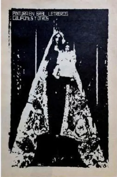
Outside the academic sphere, one of the first editorial experiments was the publication Pintura en gral: letreros califonts y otros by designers Roger Conscience (Switzerland) and Mathias Iglesis (Chile), published by the collective La Nueva Gráfica Chilena (LNGCh) in 2001. This zine-like print showcased expressions of popular graphics, such as religious and entertainment figures, as well as hand-painted signs for public buses and commercial establishments—with an authorial tone. The following year, graphic designer Esther Engelmann from Bauhaus-Universität Weimar published the article "Typographic Safari: Popular Graphics and Typography from the Streets of Santiago de Chile" (2002).

Historia del Diseño Gráfico en Chile (Álvarez, 2004) proposes a historicization based on extensive archival work and oral sources, which forms a national narrative that includes and excludes, like other histories of graphic design in Latin America. In its final section, it considers some of the "spontaneous" manifestations that are addressed in this article: "unofficial" design within a teleological vision of design in the Southern Cone, such as the seminal research projects published in the last two decades of the twentieth century and the beginning of the next, in different countries.
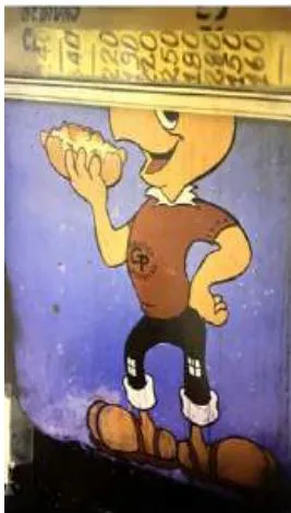
In parallel, niche books such as Modesto Estupendo (Córdova, 2004) and Micros are printed, exploring a local ecosystem through photographic documentation. The former analyzes popular manifestations of signage and murals for advertising purposes, while the latter explores a particular visual world through the personalization of the workspace and the ethos of public transportation. Micros (2006) states that the publication "aims to respectfully rescue—and keep alive—the spirit of one of the emblems of post-dictatorship urban popular culture"
(Córdova et al., 2006). Likewise, designer Pepa Foncea carries out the project Gráfica popular en los carretones en Santiago (Popular Graphics on Carts in Santiago) (2006), which results in an exhibition in the Santiago Metro—the city's main underground transportation system—at the Quinta Normal station.
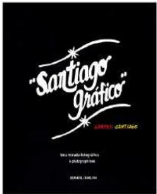
That same year, the book Santiago Gráfico/Graphic Santiago is published, a project that contains several years of photographic work by Juan Francisco Somalo, accompanied by texts from various authors. It addresses some recent ideas and issues, such as the overabundance of signage, recycling alternatives in the city's outskirts, the readaptation of objects beyond their original purpose, the impossibility of sustaining design rules in a Third-World context, and the reinterpretation of international iconographies in a local vernacular (Álvarez, Castillo, Sanfuentes, and Villarroel, 2006). This publication reveals a shared perspective that also emerges in other projects across the continent, such as Sensacional de diseño mexicano (2001), Proyecto Cartele (2002), Gráfica popular Ecuador (2007), Recuerdos de Iquitos (2009), MVD: Gráfica popular de Montevideo (2010), and Fileteado Porteño (2010), among others: a concern that initially stems from academia and later from the professional facet of "unofficial" design.
It consisted mainly defined the parameters that typesetters, photomechanical technicians, and printers had to follow to achieve the projected effect (Llop, 2014, p. 17). With the expansion of graphic production in the new digital universe, a landscape of excellent dispersion—and even deregulation—emerged, in which the skills and strengths traditionally validated in Graphic Design began to undergo a shift in processing, mainly in terms of accessibility. His was a consequence of the normalising of the practice through graphic editing software, to the point where it became difficult to predict the medium on which a given graphic message would be displayed.
III. EXPLORATION METHODS
Initially, following Gillian Rose (2023), we premised that the visual materials we attempt to examine can be "situated" in four places: that of production (self-production, small shops, neighborhood photocopy centers, small printing presses), where the image is generated; the place of the image itself—the visual content (what it displays); the spaces of circulation through which it travels (from its handmade or run-down machine-processed condition, to its presentation in a sometimes performative act); and the place where the viewer encounters the image—what we understand as reception (public buses, subway systems; central, popular, and peripheral urban areas, etc.).
From this, we consider images themselves to have their own agency, as they can potentially serve as a space of resistance. Christopher Pinney (2004) suggests that the important issue is not "how images are seen," but what they can "do" (p. 66). Following Mitchell (2020), based on three dimensions of analysis, by "image" we mean that which has a form that appears in certain media; by "object" we refer to the material support of the image; and by "medium" we refer to the set of material practices that assemble an image with the aim of producing something new: a picture, as a complex assemblage of virtual, material, and symbolic elements. In the strictest sense, a picture can be a printed item offered in public to ask for alms.
For the methodological work, various sources have been consulted. Among them, Proyectos en Artes y Cultura (Barraza and Vera, 2010), which proposes criteria and strategies for defining an idea through a series of practical tools, and establishing coherent relationships between the nature of a project and its essential components.
Investigación social: Lenguajes del diseño, edited by Manuel Canales (2013), addresses the lessons learned by a group of Latin American researchers who, in addition to their investigative practice, also supervise graduate theses. From the specific field of design, Patiño (2015) conducts an interesting historical and theoretical investigation that supports an integrated and cross-cutting research program in design education. In their A Designer's Research Manual, Visocky O'Grady (2018) present an overview of techniques and methods to incorporate into the creative design process. Muratovski (2016), in turn, offers principles for research in, for, and through design, and provides materials for qualitative visual research based on artistic/project-based media to produce and represent knowledge, ranging from films or photographs to sketches or informal notes that are part of an agency and network of expressions that build a cultural web (Charras et al., 2024).
Donoso (2019) also provides material focused on research methodology from the perspective of the professional practice, aiming to connect it with daily work while maintaining a certain distance from purely academic production. Finally, Lupton (2011) considers the visual research work as a way of collecting information that is not present in texts to analyze reviewed materials, ephemera, and transitional graphic pieces from the perspective of the image's power.
Returning to the methodological aspect, it is worth noting that the selected materials (a corpus of 100 images) come from a larger repertoire collected mainly over the past 15 years, although earlier visual and bibliographic evidence exists. Ethnographically, the relationships established with the actors (those offering graphic pieces) in public spaces have been casual and brief or mediated by minimal conversation, without structured or semi-structured interviews due to their impracticability (oral sources). Rather than "fieldwork," this was a search for graphic evidence. Regarding these subjects—who may be difficult to "study" without falling into "academic extractivism"—they are mainly people with hearing disabilities, mostly men over 30 years old up to elderly individuals with scarce resources and in poverty. For this reason, gender or intersectional postulations do not apply to this study. Additionally, in geographic terms, the vast majority of the graphic pieces (some shown here) come from the central zone (including the north-central and south-central areas) and the western part of Santiago de Chile.
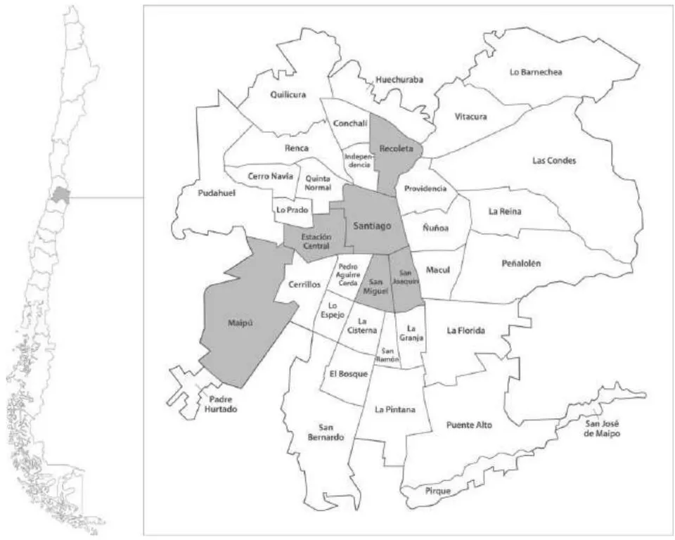
Figure 3: Map of Santiago de Chile. The municipaliti.es highlighted in gray correspond to the areas where the graphic material was collected. On the left, the map of Chile is shown to locate the study area.
Although it may seem "pretentious" to analyze this evidence in an academic context, we consider it viable to approach it through visual and design methodologies, since it is part of culture and does not exist outside of it; indeed, we believe it should not be excluded or marginalized. From a descriptive perspective, the project involves archival work and the use of a matrix or technical sheet for each graphic piece to systematize the collection of images, considering the following variables: a) title or heading of the graphic piece, b) individual or group issuing it, c) design, printer or place of issuance of the flyer, d) type of printing, inks and typographic fonts used and/or handwritten text, e) themes and motifs of the document, f) dimensions of the graphic object, and g) year of publication (declared or estimated).
On the other hand, we use an interpretative matrix to address two basic aspects: first, the graphic objects that make up this type of expression, and secondly, the coding of the graphic message itself. This mode of analysis is based on the methodological contribution of Jörg von Engelhardt (2002), who proposes that visual language is articulated through the characteristics of graphic objects and the spatial relationships they maintain with each other when interacting with other objects in a web of meanings.
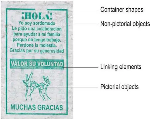
Figure 4: Diagram of graphic object components from a printed visual piece used in communications by deaf individuals. Analysis model adapted from Jörg von Engelhardt's proposal.
Likewise, we are also interested in the parametrization of graphic systems proposed by Rosa Llop (2014), which involves approaching the study of the codification of a printed product as a mode of symbolization in relation to the message's objective, examined from a semiotic perspective. This analysis later incorporates a second variable articulated around the mode of expression (the syntax of the graphic message). In this analytical proposal, among other possible ones, we can identify three strategies:
a/ Literal codification. In this type of codification, what is presented bears an evident resemblance to the object, the real physical structure, or the specific theme it represents. For example, in Figure 5, the person appealing, from their position of social disadvantage, clearly presents the communication issue through sign language, which becomes an iconic and recognizable visual system within the culture of the Southern Cone.
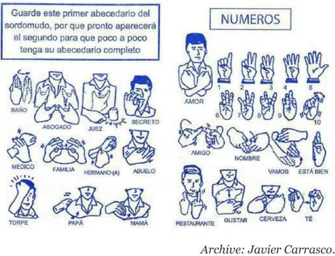
Figure 5: Printed sign language alphabet designed for communication with deaf or hard-of-hearing individuals. Single-color offset print of a fragment from a monochrome diptych.
b/ Metaphorical encoding. In Figure 6, what is displayed belongs to a different semantic field than what it directly alludes to, yet it retains a shared structure or function. In the case of the 2020 calendar (left), the photograph of a possibly stray dog symbolizes—or stands in for—the disadvantaged condition and vulnerability of the person offering the printed product. The fixed price of the calendar avoids the ambiguity or guesswork often associated with almsgiving, presenting instead a strategy of exchange within a transactional code that accounts for the production and distribution costs of the color print.
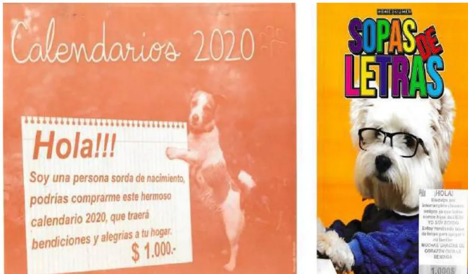
Figure 6: 2020 calendar and word scramble booklets. Left: Calendar cover printed in single-color offset. Right: Word scramble booklet. Both offered within the public transportation system (metro and buses) of Santiago de Chile.
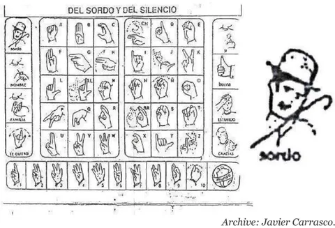
c/ Metonymic Encoding. In Figure 7, the displayed elements belong to the same semantic field as what is referenced, yet they represent it through a part of—or a potential outcome related to—that concept. In this image, classic hand sign illustrations are used, accompanied by universal concepts such as "man," "woman," "family," or "I love you." Additionally, signature traits of the fictional character's construction, such as the mustache, hat, and cane, are featured.
IV. DISCUSSION AND RESULTS
To contextualize the emergence of what we call "graphics of silence", we address the issue of individuals in vulnerable situations and how they position themselves in the spaces offered or denied by society (Lad, 2003; Libertun de Duren, 2021). In this regard, one of the first points to consider relates to the personal realization of the human being, who seeks some form of recognition. In Western societies, individuals need to engage in some form of paid activity to achieve their personal goals and, thus, attain their well-being. This conception of living has long marginalized other groups of people: the homeless, those with physical and mental disabilities, and even people who, by their own choice, disengage from any form of employment.
In the case of deaf individuals, as with people with health conditions in general, the national social structure has also discriminated against them to the point of being considered incapable of working (Ferrante, 2017). During the Middle
Ages, Christianity began to develop a foundational role in the welfare field in the West. Beggars received aid or alms from more privileged groups, who, in turn, saw in these impoverished individuals a means to achieve salvation through charity, the highest expression of Christian values (Castel, 1997, p. 51). The marginalization of this group persisted until the Enlightenment, with the work of Abbé Charles-Michel de l'Épée, founder of the first public school for the deaf in 1760, marking a significant milestone in social inclusion (Nature, 2012). Since these early educational instructions, certain advances in inclusion have been made. However, discrimination and invalidation of this group persist, with miserable pensions and weak social capital forcing them to devise strategies within the informal economy (Ferrante, 2017, p. 281).
As mentioned earlier, most of these materials have been collected over the past 15 years. One of the first evidences gathered occurs in public transportation, where a woman boards an urban minibus to solicit alms, personally extending a paper on which she conveys her plight to each of the passengers through a handwritten note.
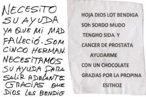
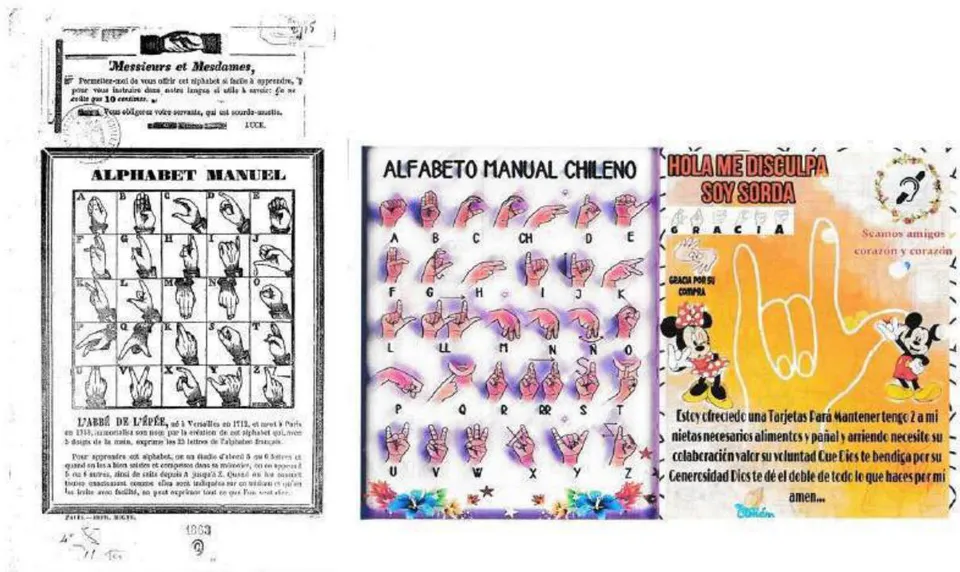
Figure 9: Comparison between a reproduction of the manual alphabet, printed in the 19th century in Paris, and a flyer distributed in the 21st century in Santiago, Chile. On the left, Manual Alphabet (1863), Charles-Michel de L'Épée (1712-1789).
These graphics are situated within the realm of popular culture, which is characterized by maintaining "a strategy of resistance against attempts of penetration and manipulation by the dominant culture" (Podestá, 1988, p. 11). By way of example, Figure 9 illustrates the discussed points. An image dating from 1863 shows hand representations for each letter of the manual (sign) alphabet, created by Abbé Charles-Michel de L'Épée. The image's composition is similar to those used today in graphics promoting the sign language alphabet: it begins with a greeting, followed by a narrative section that indicates the price of the leaflet (in this case, ten cents), and then transitions to the manual alphabet and the representation of each letter. On the right, a flyer distributed in Santiago de Chile during the second decade of the 21st century displays a compositional structure remarkably similar to the one described above.
From a historical perspective, since the invention of the printing press, there has been a close connection between religious practices and the printed materials used to disseminate it. This includes the figurative use of iconic and popular religious imagery—such as that of Jesus Christ—which also appears at the textual level. The aim is to evoke empathy or compassion in the recipient, using an instructional design that reflects the values of good Christian conduct (generosity, forgiveness, mercy, etc.), summarized in the closing phrase: "God bless you."
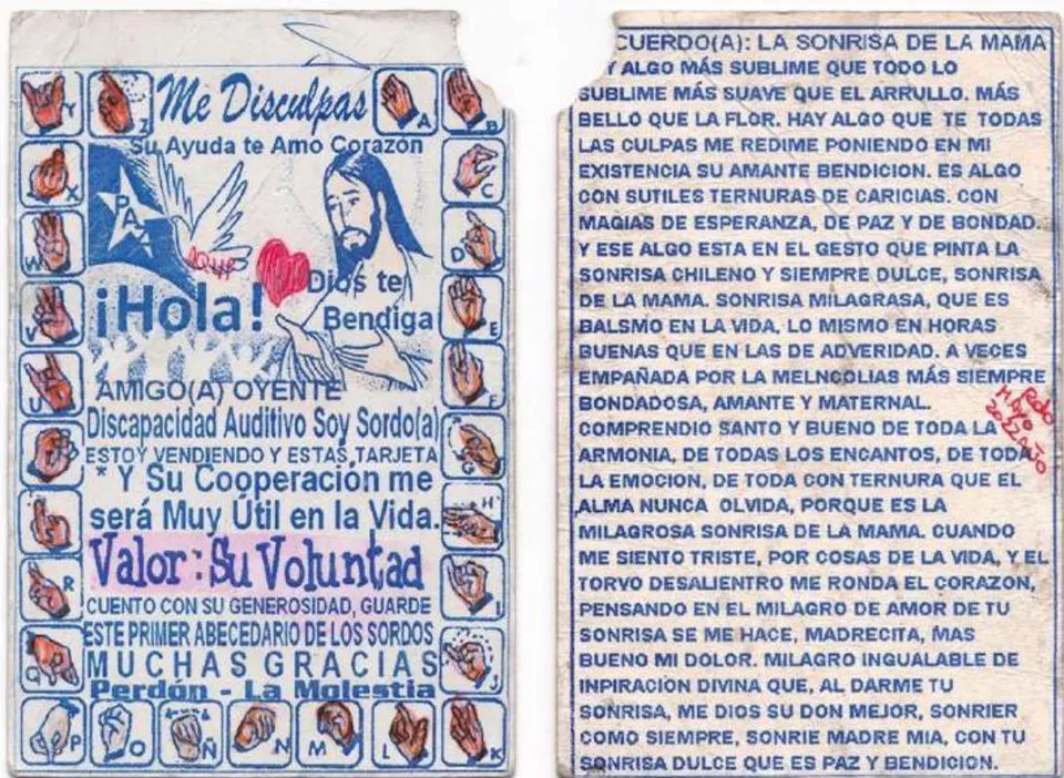
Figure 10: Example of "silence" graphic with references to Catholic order, both in figurative representation and textual content. Single-color offset print, intervened with colored markers on cardboard, 2022.
In addition to the deaf people efforts made by people trying to make a living—often appealing to religious imagery through pamphlets, flyers, and other formats—there is also evidence of private charitable institutions that have adopted and reproduced popular visual styles to solicit donations.
Such was the case in Chile with the organization Hogar de Cristo, which, in the early 1990s, reproduced designs imitating the format of public transportation tickets for its urban donation campaign. The result was a collection of five ticket-like pieces, numbered according to the coins that were in circulation at the time (1, 5, 10, 50, and 100 pesos), distributed based on the amount donated by passersby (Figure 11). One interpretation of these ephemeral prints lies in the shift of the offering party—from individual to institutional. Additionally, one can observe the appropriation of both format and visual language from public transportation tickets. The use of guilloché-style patterns—typical of numismatic design—is not arbitrary; during that period, many of the tickets used in public transportation were printed by the Casa de Moneda de Chile (Chilean Mint) (Servicio Nacional del Patrimonio Cultural, 2013).
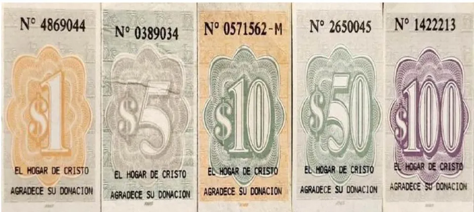
Figure 11: A collection of tickets issued by the Hogar de Cristo institution, circa 1990. Note the inscription at the bottom: "El Hogar de Cristo agradece su donación" ("Hogar de Cristo thanks you for your donation").
In line with the appropriation of imagery beyond religious frameworks, another characteristic of the graphics used by vulnerable individuals relates to the inclusion of highly recognizable cartoon characters—both regionally (such as Condorito in Chile) and globally (such as Mickey Mouse and other Disney characters, as well as Bugs Bunny or Tweety from Warner Bros., among others). These characters appear in a range of formats: accompanying a message on a flyer, included in an workbook-style booklet with word scrambles, puzzles, and other printed games. Notably, one character is conspicuously absent: Porky Pig, a stuttering pig who was once part of the imported pantheon of animated figures introduced into the country and the region through the dominant U.S. popular culture (Figure 12).
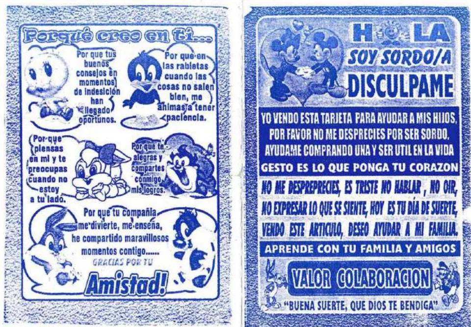
Figure 12: Single-color offset printed leaflet, circa 2014.
Here, the disabled or marginalized person appeals to two opposing worlds (north-south): the nostalgic effect of the pirated character, which is simultaneously a commercial brand (a franchise), and at the same time, an institution of Westernized animation culture—received and integrated as an established image in the Southern Cone, rather than an original character of genuine cultural contribution, since its fictional actions construct an entertainment landscape shaped by the commercial monopoly of Northern culture.
In the image that follows, which has circulated only within Chilean culture, a representation of Latin America emerges through the presence of iconic animated characters that dominated national television during the military dictatorship and the transition to democracy (1974–1990). These characters elicit alms through a message of apology and a plea to avoid contempt toward the person distributing the printed item. Bugs Bunny (locally known as el Conejo de la Suerte) raising a fist reminds of television episodes in which the animated mammal encouraged people to participate in the mid-19th-century "gold rush" in the United States or to pursue wealth through simplistic or short-term strategies.
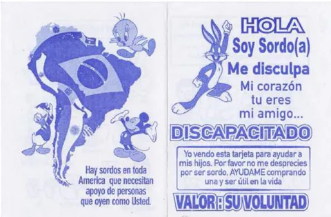
Figure 13: Diptych by disabled people to obtain resources for their daily needs. One-color offset printed leaflet, circa 2014.
In alignment with distinctly national culture, the appropriation of the image of Condorito reflects a repertoire of widely circulated popular imagery, encompassing various themes associated with this emblematic figure—such as humor and ritual (New Year's, national holidays, Christmas), food (local dishes and beverages), national identity and its construction through collective imaginaries (historical events, patriotic symbols, flora and fauna, historical figures, etc.), belief systems (fetishism, popular religiosity), and adherence to models of cultural domination (imperialism, tropicalism, technological determinism, etc.).
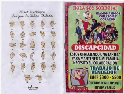
Figure 14: Diptych designed to ask for resources to support household economy. Digitally printed leaflet, 2023.
V. CONCLUSIONS
Rather than offering a definitive conclusion, this section raises a controversy: the critical examination of these types of materials, produced by individuals who are unlikely to ever access the final analysis of this article, inevitably invokes a paradox. Influential figures in design theory cited throughout this text (such as Papanek, Bonsiepe, Manzini, Escobar, among others) explore the ontological scope and boundaries of design, from the idea that "everything is design" to more professionalized or decolonial perspectives. What we face here is a form of academic extractivism, which is particularly difficult to navigate in situations of marginality. Our methodologies—largely grounded in foreign theoretical frameworks and our own academic elaborations—risk overlooking the agency and context of the people whose work we analyze.
Nonetheless, these "graphics of silence" modestly challenge the long-predicted demise of print media—predictions voiced repeatedly by various thinkers, from Marshall McLuhan in his classic The Gutenberg Galaxy: The Making of Typographic Man (1962), to David Carson and Lewis Blackwell in The End of Print (1995), or Umberto Eco and Jean-Claude Carrière in This Is Not the End of the Book (2010). These forecasts are directly contested by printed materials produced using old typographic presses, neighborhood photocopiers, offset machines, or analog-digital hybrids, all of which continue to exist in small-scale commercial, social, and territorial exchanges. What emerges is a kind of social assemblage—borrowing from Bruno Latour (2005)—between a human agent and a non-human graphic object, in which a person in poverty and affected by deafness asserts their agency through non-oral communication that becomes pure graphic expression.
What is particularly interesting here is that the natural sign language of deaf individuals acquires multiple nuances and representational forms, avoiding the need for interpretation by intermediaries and incorporating elements from both national and transnational cultures. In this context, the presence of a hearing individual is unnecessary; instead, the aim is to reach an observer or reader through visual strategies supported by materials ranging from utilitarian objects (such as adhesive bandages) to informational flyers using the visual sign alphabet itself, as well as popular and religious cultural references integrated into this visual language. These strategies give rise to a hybrid format—part leaflet, part puzzle magazine, part comic book, and part commercial flyer featuring offers and promotions.


In these printed materials, referred to here as "graphics of silence", there is a strategy for survival as well as a declaration of principles, offering a sense of belonging and identity to a group lacking collective affiliation within a system that has historically ignored them and failed to establish paths for their inclusion. The explicit recognition of selling or distributing small products—such as candy, pocket calendars, or adhesive bandages—as work (Figure 15), distinguishes these acts from traditional begging.
Beyond the established studies on "popular graphics" already present in Chile and some other countries in the region, the documentation and examination of these deaf graphics—even more fragile and difficult to trace—opens a field of inquiry (in art, anthropology, design, aesthetics, etc.) that questions the relationships and modes of making between human beings and equally fragile infrastructures. These occur within a social exchange ecosystem where graphic expression, even from a disadvantaged position, can be considered meaningful to visual culture. Although this article refers to "persons" rather than "users," the way in which these materials are obtained—and how small, declining print shops or photocopy kiosks on the verge of disappearing establish relationships with these individuals who solicit alms through a piece of design—remains a matter (and tangle) to be further explored in this research, given its many ramifications. For now, the focus remains on the graphic pieces themselves.
Conflict of Interest
The authors declare no conflict of interest.
Ethical Approval
Not applicable
Data Availability
The datasets used in this study are openly available at [repository link] and the source code is available on GitHub at [GitHub link].
Funding
This work did not receive any external funding.
References
Cite this article
Related Research

Special Issue
Launch a focused special issue to highlight research, emerging trends, and expert insights in your academic field.