


IntelliPaper
Abstract
Data visualization is the graphical display of the selected data or abstract information for several purposes: effective data exploration, called data analysis and communication. A two dimensional data table expresses numerical values precisely and it provides an efficient means to look up values for a particular dimension. When these numbers are presented as text in a table, our brains interpret them through the use of verbal processing and may fail looking for patterns, trends, or exceptions among these values. The paper tries to emphasize: advantages, lacks, limits, actualities, and potential trends in this field. Most of the figures are the result of practical tests, except the last one which is a theoretical abstraction. The information contained in numerical values becomes visible and understandable when communicated visually. The strengths of data visualization come from our ability to process visual information much more rapidly than verbal information. Good data visualization techniques and technologies translate abstract information into visual representations that can be easily, efficiently, accurately, and meaningfully decoded. Data visualization and discovery can help reduce the time users lose when they have difficulty accessing, reporting, and analyzing data. Data visualization and discovery can help reduce the time users lose when they have difficulty accessing, reporting, and analyzing data. Visualization affects how data is provisioned for users and the value they gain from it. Because users examine snapshots to identify changes in data over time, they must be n provisioned and presented consistently.
Explore Digital Article Text
INTRODUCTION
"In a world increasingly saturated with data and information, visualizations are a potent way to break through the clutter, tell your story, and persuade people to action" - Adam Singer, Clickz.com, "Data Visualization: Your Secret Weapon in Storytelling and Persuasion", October 2014. By visualization, we refer to "interactive data visualization" as defined by and described extensively by Ward et al. Regardless of how much data we have, one of the best ways to discern important relationships is through advanced analysis and high-performance data visualization. It is much easier to understand information in a visual compared to a large table with lots of rows and columns. The recognized functions of business intelligence technologies are: reporting, online analytical processing, analytics, data mining, business performance management, benchmarking, text mining, and predictive analytics. Using illustration and graphic design tools, data can be visualized using static graphical content, animated movies and 3D models, and interactive visualization tools and presentations can be commissioned for web hosting or event displays. Drawings of business processes, locations or trends can also be produced to illustrate concepts and enhance the presentation of information. According to Friedman the main purpose of data visualization is to communicate information clearly and effectively through graphical means. But that doesn't mean that data visualization needs to look boring to be functional or extremely sophisticated to look beautiful. The idea is to create both aesthetic and functional data visualizations in order to provide insights and intuitive ways of perceiving complex data. A fast, fluid dialogue with data that are being analyzed makes it easy to see new patterns, spot new trends, and ask new questions. In fact, visualization is more important than ever, because with all the information that's available, it's getting harder and harder to sift through the clutter to understand what's valuable(Oracle, 2015). The visualizations make it easy to see patterns and trends and identify opportunities for further analysis. To create meaningful visuals of data, there are some basics which should be considered. Data size and column composition play an important role when selecting graphs to represent that data. If we are working with massive amounts of data, one challenge is how to display results of data exploration and analysis in a way that is not overwhelming. We may need a new way to look at the data – one that collapses and condenses the results in an intuitive fashion but still displays graphs and charts which data analysts are accustomed to seeing. Also, massive amounts of data bring new challenges to visualization because of the speed, size and diversity of data that must be taken into account. Using new technologies, the results can be made available quickly via mobile devices, and provide users with the ability to easily explore data on their own in real time. An easy-to-use data exploration interface enables data analysts to create and interact with graphs so they can understand and derive value from their data. However, no matter how powerful is the data visualization tool, the people analyzing the data must have a deep understanding of where the data comes from and knowledge to interpret the information.
Data visualization is one of the great innovations of our time. From the moment most of us wake up in the morning, infographics and other visual representations of data fill our lives. Whether these visualizations are presented as part of our work, to enrich our enjoyment of sports, to deepen our understanding of current events, or to track household expenses, we encounter graphical images of data every day and try to make sense of them. Quantitative communication through graphical representation of data and analytical concepts is essential to surviving amid the deluge of data flowing throughout our world. Data visualization sits at the confluence of advances in technology, the study of human cognition and perception, graphical interfaces, widespread adoption of standards for rich Internet applications, and the continuing expansion of interest and experience in analytics and data discovery. Data visualization can contribute significantly to the fruitful interpretation and sharing of insights from analytics, enabling nontechnical SMEs to perform data discovery in a self-directed fashion. Implementation of chart engines and the growth in the number and variety of visualizations available in graphics libraries are supporting new sophistication in visual analysis, allowing users to go beyond simple bar and pie charts to express more advanced insights about quantitative information.
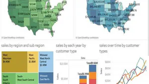
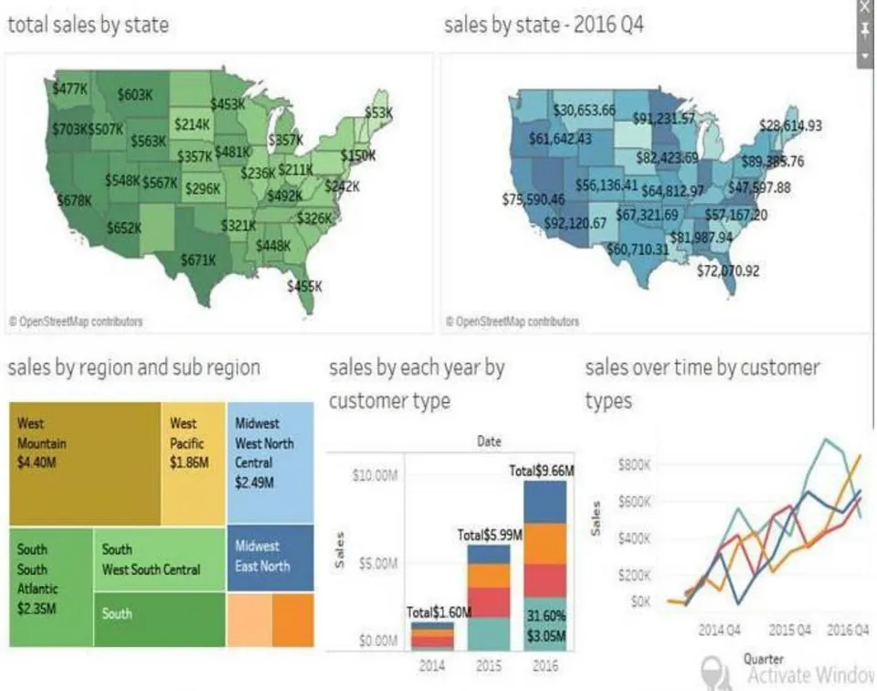
Users need data visualization for a variety of Decision Making and analytics activities, including reporting, scorecards, operational alerting, and data discovery and analysis. Rather than just giving users "newtoys" to play with, organizations should examine how they can match visualization technologies and practices to user requirements as shown in Fig 1. Across the board, however, a key element in the success of visualization is data interaction; users need broad capabilities for manipulating data, including to drill down, cross cut, slice, and dice data directly from graphical interfaces.
{"image_source":{"path":"images/a60e3d88b39afb845c2421a3c81e381507f177b098b9e37fb0733cabd4d2c8e7.jpg"},"content":"","chart_caption":[{"type":"text","content":"Fig.1: Data Visualizations showing Sales over time in quarters"}],"chart_footnote":[]} For many organizations, dashboards take the center stage for data visualizations, especially for decision making reporting and performance management. Many users would like to consolidate views of multiple sources and types of information into their dashboard workspaces. One new source of interest is geographical information. Although using maps to enhance corporate data (and vice versa) is not yet widespread, organizations in a growing number of industries are interested in geospatial analysis as an addition to their visualization repertoire. Mobile device adoption is likely to accelerate interest in visualizations offering location information and geospatial analysis; frontline employees in sales, service, and support will use these technologies to enhance customer interactions. Humans are born to perceive meaningful patterns, outliers, and structures in what they see. Our Processing of information is guided by how it is presented, including attributes such as color, size, texture, density, movement, and more that activate our visual sensitivity.
Psychologists and brain scientists have studied extensively how humans respond to graphical stimuli and how we use short and long-term memory to bring previous experiences to bear on the processing of information. These Studies are becoming increasingly important as professionals in all walks of life, including physicians, pilots, financial services specialists, law enforcement and military personnel, and more depend on data visualization to make decisions and discover new insights to drive strategy. "We acquire more information through vision than through all of the other senses combined," according to ColinWare, in his book Information Visualization. "The 20 million or so neurons of the brain devoted to analyzing visual information provide a pattern-finding mechanism that is a fundamental component in much of our cognitive activity." Graphical interaction with data is fast becoming the expected norm for the full spectrum of users, from executives to frontline personnel. Visualization is therefore a key concern for business intelligence and data analysis professionals because it affects how data is provisioned for users and the value they gain from it. Good data visualization is critical to making smarter decisions and improving productivity; poorly created visualizations, on the other hand, can mislead users and make it more difficult for them to overcome the daily data onslaught. Users can lose confidence in their business intelligence (DECISION MAKING) systems if they are unable to understand or trust what they see. To sharpen our research view of what organization are doing with visualization and how they are meeting user requirements, we asked respondents which types of activities they are currently implementing or are planning to implement with their data visualization technologies. We identified these activities as falling into three common types, discussed next. We will refer back to these three main activities throughout the report:
Display/snapshot reporting (including scorecards)
Operational alerting
Visual discovery and analysis
Many organizations are implementing dashboards to display basic reports, including on mobile platforms. Snapshot reports are typically scheduled rather than requested on demand, although some users create snapshots manually. The results are often stored for users in a cache or database as a "snapshot" of a certain point in time. Because users examine snapshots to identify changes in data over time, they must be provisioned and presented consistently so that the trends and comparisons drawn are valid. The viewing format, including the use of animation or other options for richer visualization, can depend on the user's application platform or whether the request is made through aWeb browser that supports industry standards such as AJAX, HTML5, and Microsoft Silverlight.Scorecards, which are often used with corporate performance management methodologies, help orient personnel toward achieving particular goals. Key performance indicators (KPIs) and other metrics help personnel measure and manage progress toward the goals over time. Scorecards can provide essential context for looking at historical trends and projecting future results. Innovative Organizations let their interface designers loose on scorecards to create graphical representations that replace standard data tables and charts with gauges, widgets, dials, race cars, or other imagery to inspire employees in the context of their roles and levels of accountability.
II. VISUAL DISCOVERY AND ANALYSIS
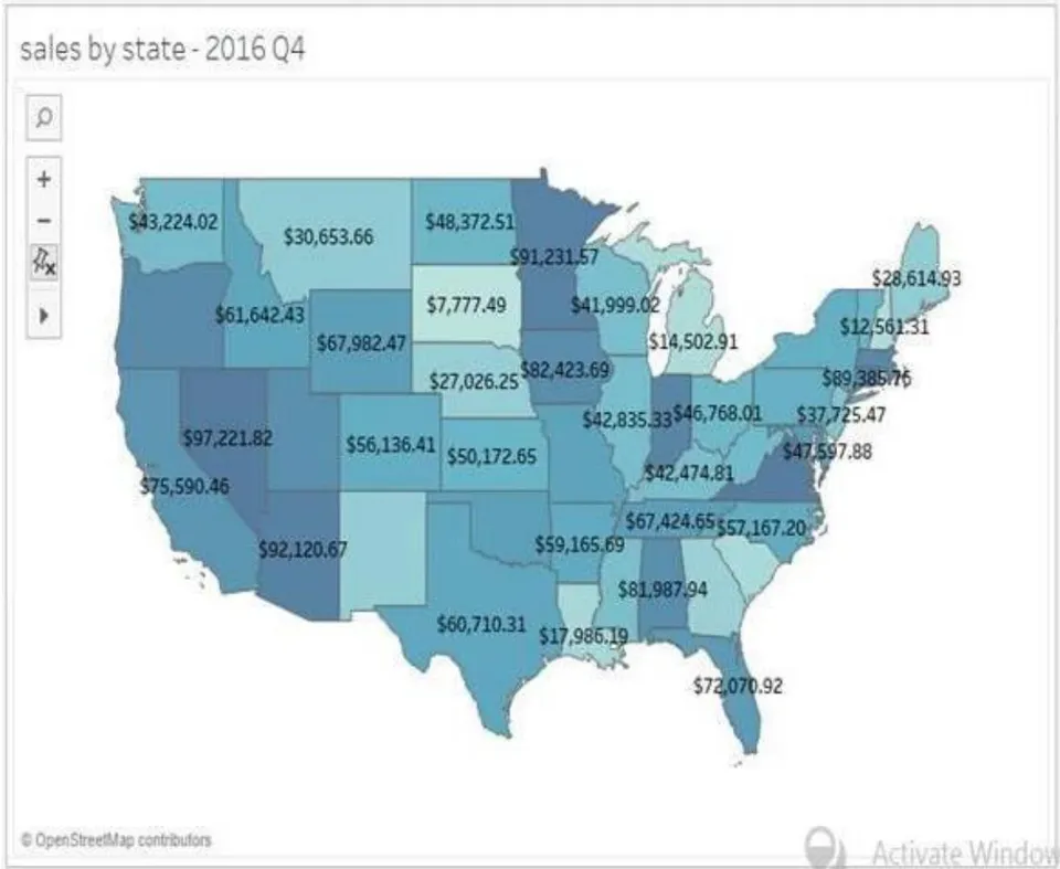
Business analysts, data analysts, and a growing segment of nontechnical users across organizations want to go beyond the limits of reporting and predefined metrics to examine data and discover interesting relationships, patterns, and answers to their "why" questions. When practices for analytical reasoning, test-and-learn inquiry, and advanced computation are fused with datavisualization, the result is "visual analytics." As shown in Fig 2, a heat map showing the sales by area and different colors representing regions.
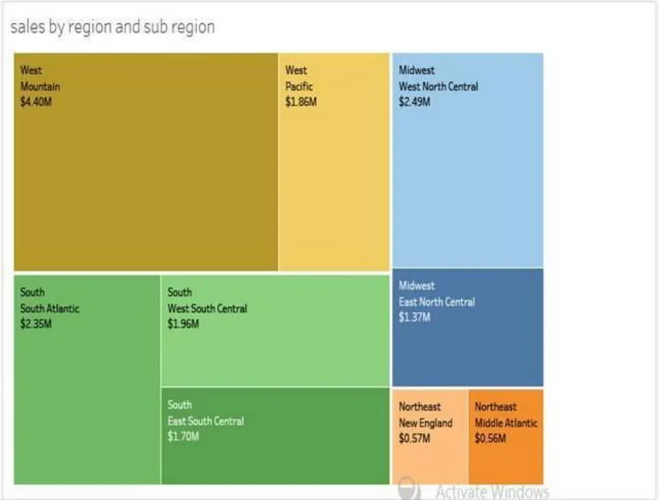
Visual analytics enables business users to interact with data and engage in analytical processes through visual representations supported by powerful computer graphics engines, and often integrated, in-memory storage of data that facilitates rapid updates of multiple visualizations based on users' interaction. Visual functionality for filtering, comparing, and correlating data can then be integrated with the users' analytical application functions for forecasting, modeling, and statistical, what-if, and predictive analytics. The term "visual data discovery" is essentially synonymous with "visual analytics"; in industry usage, it applies to tools and practices that make it easier for nontechnical business users to interact with data. The tools enable users to engage in self-service data analysis through visual representations rather than the tabular results delivered by standard business intelligence queries. Visual discovery frees users from the typical decision making constraints of predefined questions and known types of answers, such as the sales figures for a given region. Users have the freedom to look for insights that numbers such as sales figures alone can hide. However, rather than give users a complete blank slate, most visual data discovery tools guide users in selecting the right visualizations or even automate the selection. Some tools include predictive modeling capabilities to direct users to examine what is most important going forward. Predictive Modeling complements visual discovery, especially when there are large data sets to examine with many dimensions and variables. Visual data discovery and analysis will be discussed throughout this report; the purpose here is to offer brief definitions
III. BUSINESS BENEFITS, BARRIERS, AND OBJECTIVES
Reducing time to insight is a critical objective for enhancing visualization help for decision making, data discovery, and analytics applications, no matter which of the three main visualization activities is the primary focus. Today, it is not only line-of-business (LOB) operations managers who need actionable insight from low-latency data; CEOs and other top executives at industry-leading organizations are also demanding faster data insights. They are directing the creation of real-time decision support "cockpits" that feature advanced data visualization. From the central location of a cockpit, executives can view high-resolution screens with dashboard reports and analytics that let them monitor whether projected trends for customer demand, marketshare, profitable decision making, and other measures are playing out as expected. Executives in marketing are also implementing cockpits to monitor the performance of campaigns across multiple channels and to analyze sentiment expressed in social media. Visual discovery delivers the decision making picture for financial analysis. Reducing time to insight is critical for many organizations, but sometimes not all departments and divisions get the tools they need to make this happen for their concerns. Executives and customer-facing groups such as marketing, sales, and service usually come first. Finance and business management users are often left to use spreadsheets and back-end accounting systems, with custom coding required to supply data for analysis. If these users implement more sophisticated budgeting, forecasting, and planning applications, these are often removed another step further from the data. However, with data analysis becoming ever more essential to financial performance management, business and finance managers are beginning to implement tools that enable them to easily drill down into the data behind key performance indicators and scorecards in their budgeting, forecasting, and planning applications. Visual discovery can decrease time to insight for performance management. With self-service capabilities, the tools can reduce users' dependency on IT to custom-build visual reports and code access to data.
IV. USERS NEED VISUALIZATION TO CREATE A SINGLE VIEW OF INFORMATION
Organizations implementing advanced dashboards are able to provide mashups of data from multiple sources, both internal and external, including news and social media feeds. Such dashboards can improve employee productivity where staff currently find it necessary to jump from report to report and across different applications to gain a complete view.
4.1 Implementation Practices for Better Decisions
With these business benefits, barriers, and objectives in mind, we can now turn to implementation issues and look at how organizations can use visualization to arrive at better decisions. Increasingly, implementation success rises and falls with users, not IT; dashboards, visual analytics, and discovery tools are giving users more control, enabling them to progress further on their own rather than depend on IT. This is important for large organizations where IT application backlogs are a problem; it is also a significant benefit for small and midsize firms that do not have extensive IT support for visual reporting and analysis. However, as always, with the advantages come new challenges.
4.2 Most Popular Visualization Types
Along with functionality, users are gaining versatility through the growing libraries of visualization types that many tools offer. In addition to those provided by software vendors, visualization types are increasingly available from developers who are building them for specific industries, data sources, and more. As visual analytics become more prevalent, users will see things that others are doing and will want to follow suit; they may also be required to use certain visualization types associated with their industry or with access to a particular data source. Organizations should therefore consider technology architecture that allows their users to expand the variety of visualization types they use, rather than restrict selection.
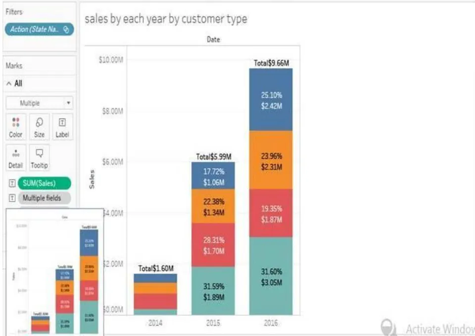
{"image_source":{"path":"images/0d96e1e48a3f2b779813d5b860f28e8ad6ada8b663a5c8e8aa6d8f89a5f31538.jpg"},"content":"","chart_caption":[],"chart_footnote":[]} {"image_source":{"path":"images/ea17eec026f0e793fa5b3f4e9b1f0974ca7d7641d609b6fa82de02a67d4a3f12.jpg"},"content":"","chart_caption":[{"type":"text","content":"Fig.5: Data Visualizations showing the dashboard in tableau"}],"chart_footnote":[]}
V. CONCLUSION
Data visualization does not belong to a single academic discipline. Statisticians, computer scientists, data analysts, graphic designers, psychologists and others practice and contribute to the development of data visualization concepts and tools. Recently, data visualization has been popularized through free (open-source) or commercial software products. Interaction in visualization enables the fast exploration and discovery of data patterns that the user may not even have expected. Simplest interactions are tooltips or other data displays that appear when the user points at a part of a visualization. Filtering data is important when dealing with large datasets. Finally, details on what is shown can be retrieved by the user as needed (drill down/drillup). All of these steps require interaction, and are well supported by both technologies dealt in the paper. There are many ways to conceive business graphics and data visualizations for business intelligence. The point is not to confound between these two categories because the last one is much more concerned about insights and consequently its techniques and instruments are more sophisticated and up-to-date.. These visualizations capture meaningful information that cannot be observed from a single story snapshot, or from the raw data contained in a repository, and provides a meansfor authors to interpret each others' creative intent. Our user studyvalidates the efficacy of our tools and our results show a variety of stories authored by untrained users, who have used our system forthe first time.
Limitations and Future Work. Additional limitations hint at more far-reaching futurework. Timing in our system is not represented explicitly but is defined implicitly by the given story beats. A more robust and flexible timing model could provide an additional level of control to story authors. In our work, conflict resolution operates only at the syntactic level when tree operations fail. Exploring semantic, rather than syntactic, conflicts is an exciting research direction. Such semantic detection could flag anachronisms such as a character appearing in a story after he or she has passed away. Detecting, communicating, and offering resolution suggestions for such semantic issues is a challenging future direction. Even more exciting future work could focus on extending semantic understanding to provide deeper assistance to story authors, such as suggesting portions of the story that would be most interesting to develop further.
Decision making is more a business-oriented tool, addressed to data analysts who need better means of discovering and sharing data insights, all with less IT oversight. Both Technologies support development of applications for exploring large quantities of data, designed to support interactivity and decision making tasks. In the future we intend to integrate data visualization components with data mining algorithms to find meaningful data patterns and to provide a better way to explore those atterns.
Conflict of Interest
The authors declare no conflict of interest.
Ethical Approval
Not applicable
Data Availability
The datasets used in this study are openly available at [repository link] and the source code is available on GitHub at [GitHub link].
Funding
This work did not receive any external funding.
References
Cite this article
Related Research


Special Issue
Launch a focused special issue to highlight research, emerging trends, and expert insights in your academic field.